Dashboard
The SmartyGrants dashboard delivers instant insights to help grantmakers visualise your data and to help you interrogate and think more strategically about your funding patterns.
The widgets allow you to see at a glance which rounds are getting the most traction, and to monitor your approval and submission rates. You will also see which subject areas and beneficiary groups are benefiting most from your funds, and how gender-aware your applicants are.
Data is drawn from a mixture of common fields across the system, as well as CLASSIE standard fields (the information icon at the bottom of each widget explains precisely which data is being represented).
You may filter widgets by Program, Round and Submission Date.
Please Note: the data represented in the widgets updates at 2am AEST each morning, and covers the full time period that your account has been operational.
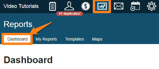
Where is the Dashboard?
When you first log into Smartygrants you will find the Account Summary and My Tasks widgets on the programs page. All other Dashboards can be found under the reporting icon. Click on the report icon at the top of the screen. The Dashboard is the first tab available in Reporting.
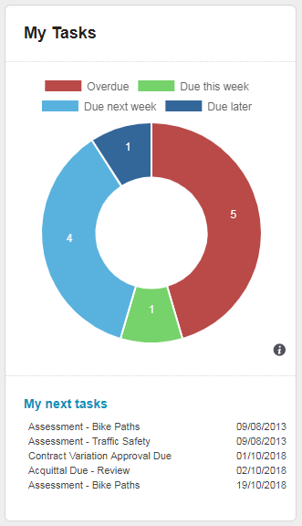
My Tasks
The My Tasks widget is a summary of open tasks assigned to you. Displayed as a doughnut graph, the widget has clickable links that are itemised by overdue, due this week, due next week and due later. The widget also displays a listing of your next five upcoming tasks.
Account Summary
When you first log into SmartyGrants you will find an Account Summary on the 'Select a Program' listing page. The Account Summary displays three separate widgets:
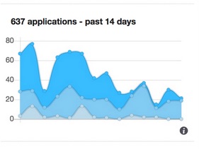
Applications received in the past 14 days
This stacked graph depicts the number of applications that have been received in the past 14 days. It includes primary application forms submitted to open and closed rounds (including archived rounds, excluding test rounds) based on first submission date. The graph will display up to three lines representing the rounds receiving the most applications during the past 14 days. The top two lines show the rounds with the highest number of applications submitted, the bottom line shows the total of all other remaining rounds. Hover on the dot to show the round name, or on a dot to show the date and number of applications received for that round.
What questions does this graph answer?
How busy are our open rounds right now?
Which are our most busy rounds?
Why does this matter?
If the application submission rate appears lower than expected there may be an issue that needs to be addressed.
Application Approval Rate

These bar graphs depict the application approval rate for all open and closed rounds (including archived rounds, excluding test rounds), as a percentage and also dollar value. The complete bar shows all submitted applications with a decision status of Approved or Declined, while the left-hand, dark blue section of the bar shows the percentage of those with the decision status of Approved. More information on recording decisions.
The dollar value graph utilises the Standard Field "Total amount requested" (across Approved and Declined applications, as shown on the Summary tab) and totals all Funds allocated (for Approved applications). Applications will only be included in the dollar value graph where the "Total amount requested" standard field was used.
What questions does this graph answer?
What is the success rate for applicants to my programs? Or, how many people who apply to us for a grant miss out?
How big is the gap between the demand for our funds and our ability to fund?
Why does this matter?
A low approval rate may indicate that a large number of applicants are wasting their time in applying (and yours, in assessing).
A low dollar-amount percentage indicates there is a lot of unmet demand for your funding.
Application Submission Rate
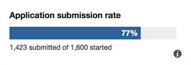
The application submission rate shows you the percentage of all application forms that have been submitted, compared with how many forms have been started. This number and percentage looks at all closed rounds, including archived rounds, (excluding test rounds)
You are able to see the number of application forms that have been started (including those submitted), and the percentage illustrates the applications that were subsequently submitted.
What question does this graph answer?
What proportion of people who started an application did not submit it?
Why does this matter?
A high non-submission rate may indicate there are problems with your guidelines, your form, or there may be some other factors at play.
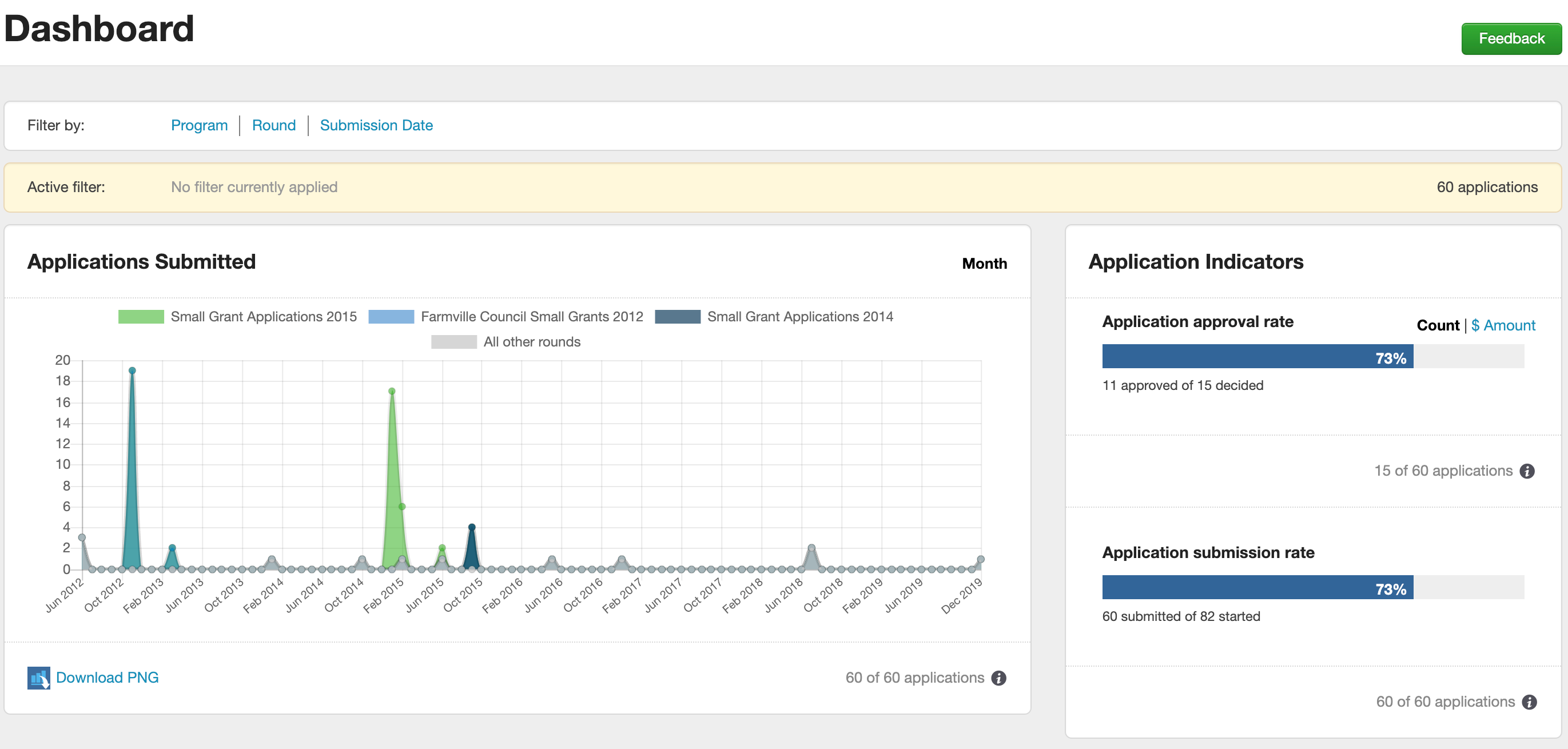
Applications Submitted
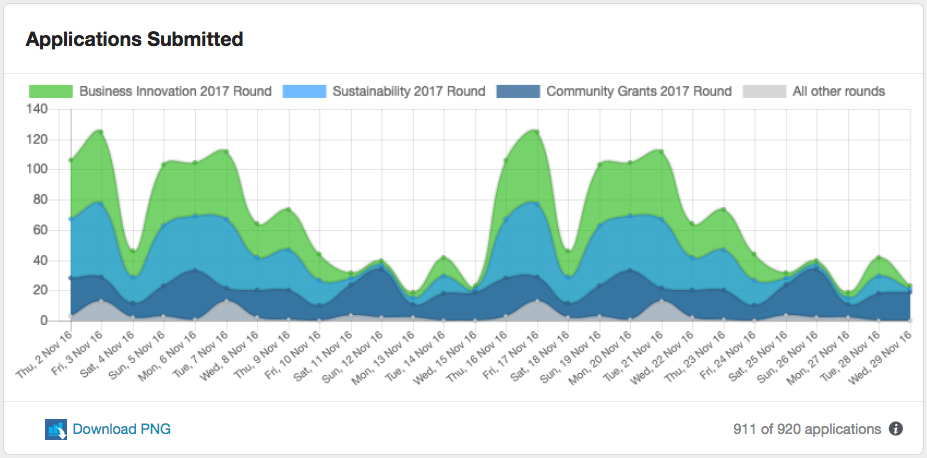
This stacked graph depicts the number of applications received for selected rounds within the selected time frame. It includes primary application forms submitted to open, closed and archived rounds based on first submission date (test rounds are excluded). The graph will display up to four rounds, as selected via the filter. If more than four rounds are selected, the top three lines show the rounds with the highest number of applications submitted, and the bottom line shows the total of all other selected rounds. Hover on a dot to show the round name, submission date and the total number of applications received on that date for that round.
The data used for this graph can be selected using the filter options at the top of the page.
For more information on stacked area graphs please visit the Data Visualisation Catalogue.
What questions does this graph answer?
- How busy are our open rounds right now?
- Which are our most busy rounds?
Why does this matter?
If the application submission rate appears lower or higher than expected there may be an issue that needs to be addressed.
Application Indicators
 Application approval rate
This bar graph depicts the application approval rate for the selected open and closed rounds (including archived rounds, excluding test rounds). The graph can be toggled to view the approval rate by application count, or by dollar amount. The complete bar shows the total number or monetary value of submitted applications with a decision status of Approved or Declined, while the left-hand, dark blue section of the bar shows the percentage of those with the decision status of Approved. Clicking the toggle “Count | $ Amount” will change the data displayed from a count of applications to the dollar amount of those applications.
The data used for this graph can be selected using the filter options at the top of the page.
The dollar value graph utilises the standard field "Total amount requested" (across Approved and Declined applications, as shown on the Summary tab) and the sum of all Funding Allocations (for Approved applications). Applications will only be included in the dollar value graph where the "Total amount requested" standard field is used.
What questions does this graph answer?
- What is the approval rate for applications in my programs? How many people who apply for our grants miss out?
- How big is the gap between the demand for our funds and our ability to provide funds?
Why does this matter?
- A low approval rate may indicate that a large number of applicants are wasting their time in applying (and yours, in assessing).
A low dollar-amount percentage may indicate that there is a lot of unmet demand for your funding.
Application Submission Rate
This bar graph depicts the submission rate for the selected closed rounds (including archived rounds, excluding test rounds). The full bar shows the total number of primary application forms that have been started, while the left-hand, dark blue section of the bar shows the percentage of these that were subsequently submitted.
The data used for this graph can be selected using the filter options at the top of the page.
What question does this graph answer?
- What proportion of applicants did not proceed to submission?
Why does this matter?
A low submission rate may indicate there are clarity problems in your guidelines or your form, or that your timeframes are too tight, or there may be some other factors at play.
For more information on stacked area graphs please visit the Data Visualisation Catalogue.
Funding by Subject
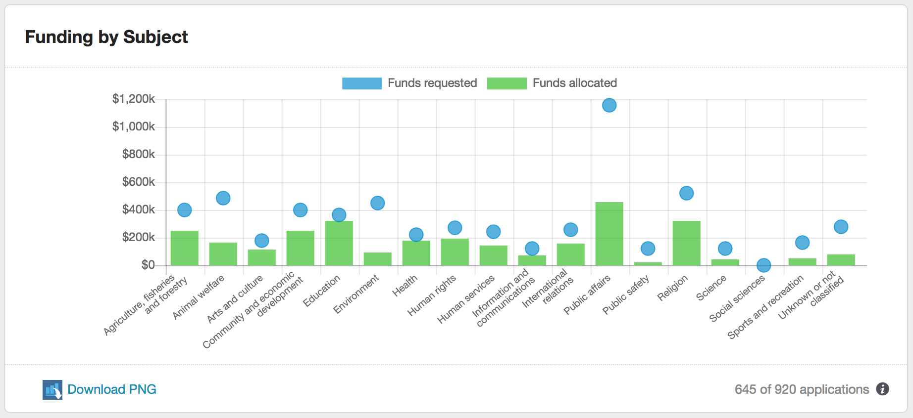
This bar graph depicts which types of projects are receiving your grants, compared with the demand for those funds, grouped by CLASSIE subject. All CLASSIE Level 1 subjects are shown on the bottom axis (including Unknown), with the funds requested for each subject shown as a dot point, contrasted with the solid bar representing funds allocated (based on the application decision).
This graph uses the CLASSIE standard field "Project Subject – Anticipated”, the “Total amount requested” standard field, and recorded funding allocations. Funding allocations will only be included in the graph where both standard fields were used.
If no data is showing in this graph, please verify that both standard fields are in use on your forms and that funding allocations have been recorded. All rounds can be selected for this graph with the exception of Test rounds.
Note that applicants can select up to 5 subjects drawn from any level within the CLASSIE hierarchy and this graph needs to represent the data across those choices. Items selected by applicants from lower levels of the CLASSIE hierarchy will be rolled up into its corresponding Level 1 item. If an applicant has requested $1000 and selected two subject items under different Level 1 categories, these will be represented as $1000 for both Level 1 categories (not $500 each). If an applicant has requested $1000 and selected two subject items that both fall under the same Level 1 category, this will be represented as $1000 under the one Level 1 category.
An example of this is outlined below:
| Application | Selections | Funds allocated | Value shown on graph |
|---|---|---|---|
1 | Arts > Dance Arts > Dance > Ballet Arts > Dance > Interpretive Education | $1000 | Arts & Culture = $1000 Education = $1000 |
2 | Sports | $1000 | Sports = $1000 |
3 | Health Health > Aged care Education | $1000 | Health = $1000 Education = $1000 |
Total shown on graph |
|
| Arts = $1000 Education = $2000 Health = $1000 Sports = $1000 |
The data used for this graph can be selected using the filter options at the top of the page.
What questions does this graph answer?
- Are our grants going to the 'right' types of projects? For example, if you only want to fund Health projects, you shouldn't see much (or anything) appearing in other subjects. Alternatively, you may be keen to see a good spread across all subjects.
- Are some subjects receiving a higher allocation than others?
- What does the funding demand look like, when split by subject?
- Are we meeting demand? Are some subject areas under- or over-served by our grants?
- Are the types of projects/programs that we fund changing over time?
Why does this matter?
Answering these questions will help you to gauge whether your funding intentions track with your funding decisions. They may also help to guard against unconscious bias in favour of or against particular subject areas in the assessment process. And they will help you learn more about sector-based demand for your grants.
For more information on bar graphs please visit the Data Visualisation Catalogue.
Top 10 Beneficiaries
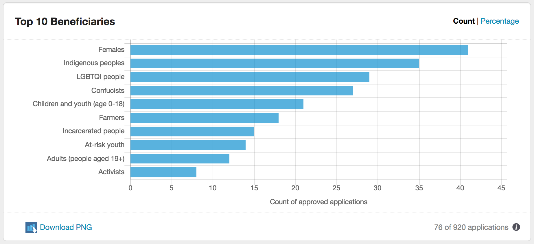
This horizontal bar graph shows the top 10 beneficiary groups identified within approved applications for your programs, either by count or percentage of applications. It includes the “No specifically targeted beneficiaries” category.
This graph utilises the CLASSIE standard field “Project Beneficiaries”. If no data is showing in this graph, please verify that the standard field has been included on your forms.
Applicants may choose as many beneficiaries from the CLASSIE list as they wish (and from any level of CLASSIE) but this graph rolls all data from lower levels up to Level 1. If an applicant has nominated two beneficiaries under different Level 1 categories, these will be represented as one beneficiary for each Level 1 category. If an applicant has nominated two beneficiaries that both fall under the same Level 1 category, this will be represented as one beneficiary under the Level 1 category.
The data used for this graph can be selected using the filter options at the top of the page.
What questions does this graph answer?
- Which types of beneficiaries are most commonly targeted in the projects/programs we fund?
- Are there differences in targeted beneficiaries for different programs/rounds?
- Are our beneficiary trends/preferences changing over time?
Why does this matter?
Answering these questions will help you to better understand the intended beneficiaries of the projects/programs funded by your grants, and to assess whether this tracks with need, demand and intention.
For more information on bar graphs please visit the Data Visualisation Catalogue.
Gender Lens Result
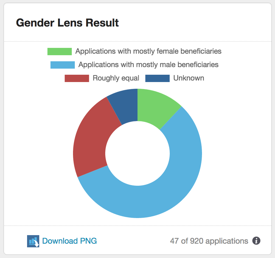 This doughnut graph shows what proportion of your funded projects/programs favoured men, what proportion favoured women, what proportion recorded a roughly equal split between men and women, and what proportion did not track the gender of their beneficiaries.
The graph utilises the CLASSIE standard field “Gender Lens Result – Actual”, which asks grant recipients to document what percentage of their project/program beneficiaries were women or girls.
The graph is divided into four segments, representing ‘mostly female’, ‘mostly male’, ‘roughly equal’, or ‘unknown’. Where the grant recipient has indicated that more than 55% of the beneficiaries were women/girls, this is included in the ‘mostly female’ segment of the graph. Where they’ve given a figure of less than 45%, this is shown as ‘mostly male’. ‘Roughly equal’ indicates 44-55% of beneficiaries were women. ‘Don’t know’ shows what proportion of respondents ticked the ‘unknown’ box on the form.
The data used for this graph can be selected using the filter options at the top of the page.
What questions does this graph answer?
- How gender-aware are my applicants? What proportion of them record the proportion of men to women that their projects/programs are reaching?
- Is one gender getting better access to our pool of grants?
Why does this matter?
- A gender-wise grantmaker is one that encourages their grantees to consider gender in the design and management of their initiatives. If your grantees are not tracking the gender of their beneficiaries they cannot know whether they’re favouring one gender over another.
- If you are not running a program that is specifically designed for men/boys, you will want to ensure that your funds are reaching women/girls at a roughly equal level. This graph will provide you with some indication of whether you’re achieving that aim.
For more information on donut graphs please visit the Data Visualisation Catalogue.