Location data and maps
Analytics is an embedded reporting tool that allows you to create, monitor, and export live dashboards that visualise data about your grants.
This article explains how to create maps and display Applicant Primary and Project Location addresses on the map. For details on how to create other types of custom dashboards, please refer to Creating and managing custom dashboards.
Table of contents
The Location table
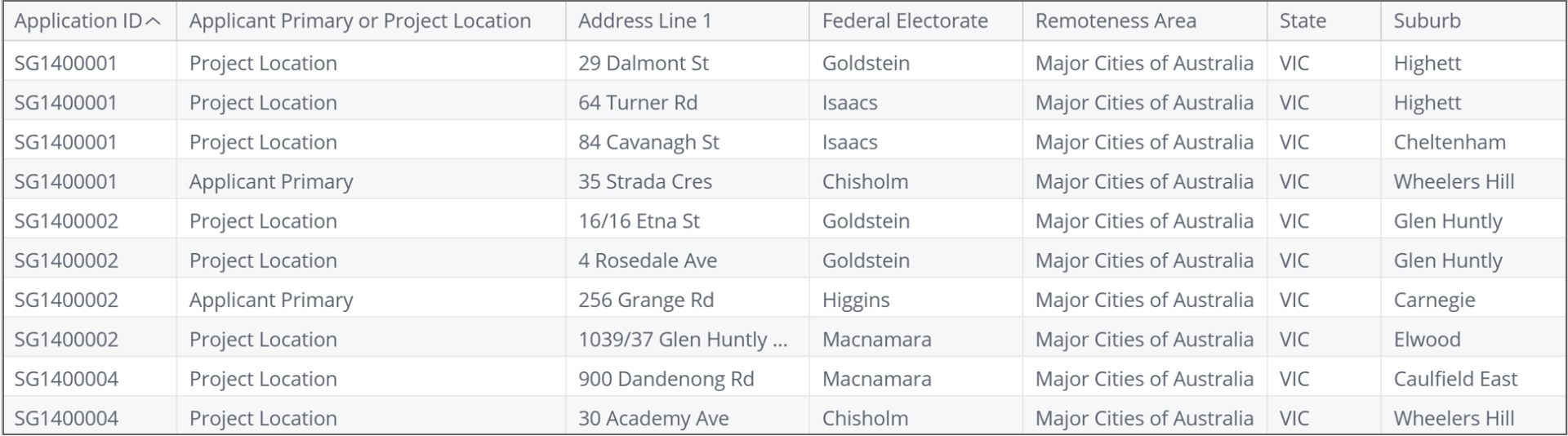
The Location table stores Applicant Primary and Project Location addresses associated with applications. Addresses can fall in various boundaries (an address is in a certain state, suburb, state electorate etc). Use fields in the Location table to find the boundaries associated with an application’s addresses:
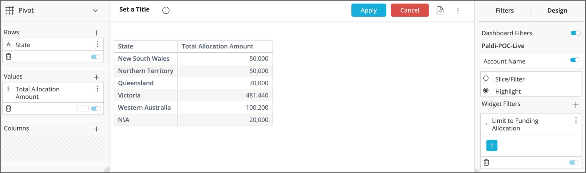
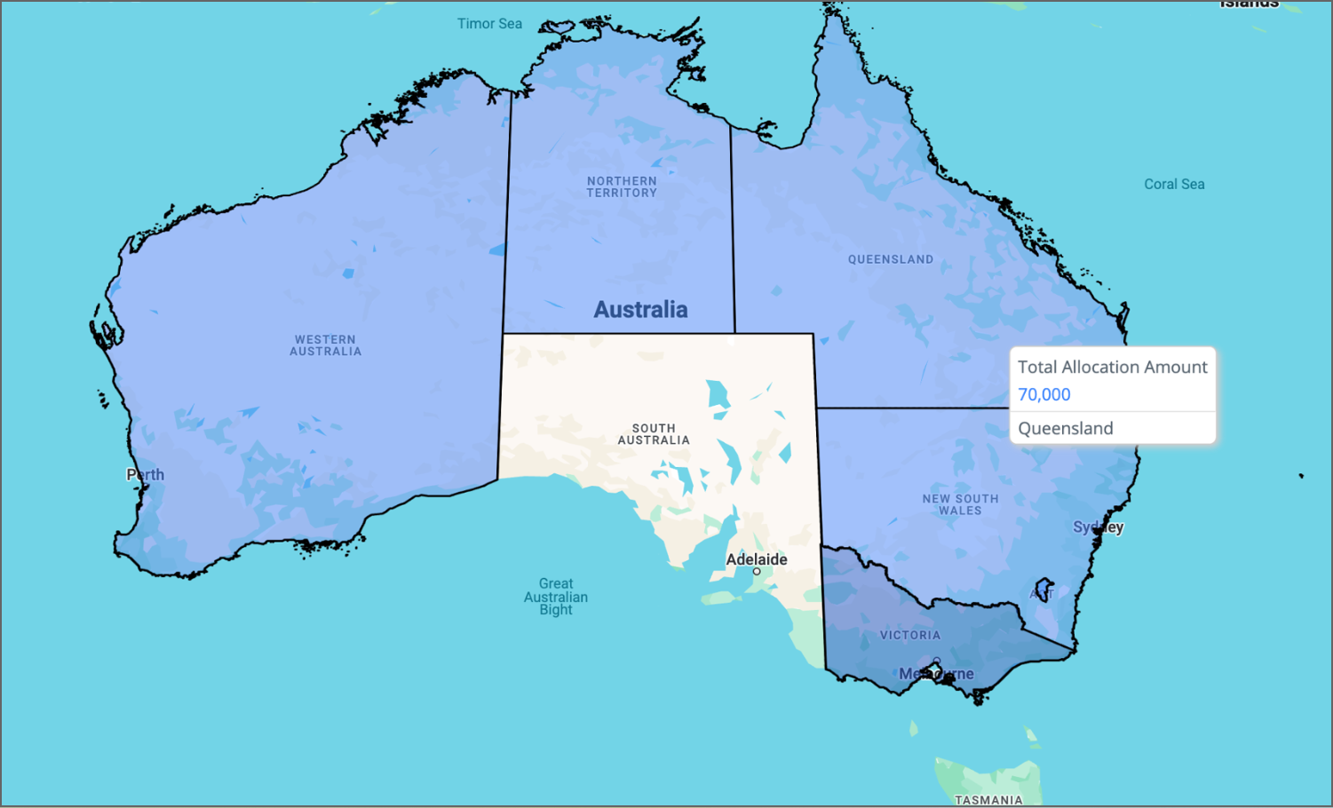
Boundary fields in the Location table can be used to group and aggregate data geographically. The pivot table below shows the funding allocated to applications whose Applicant Primary / Project Location addresses fall in a particular state:
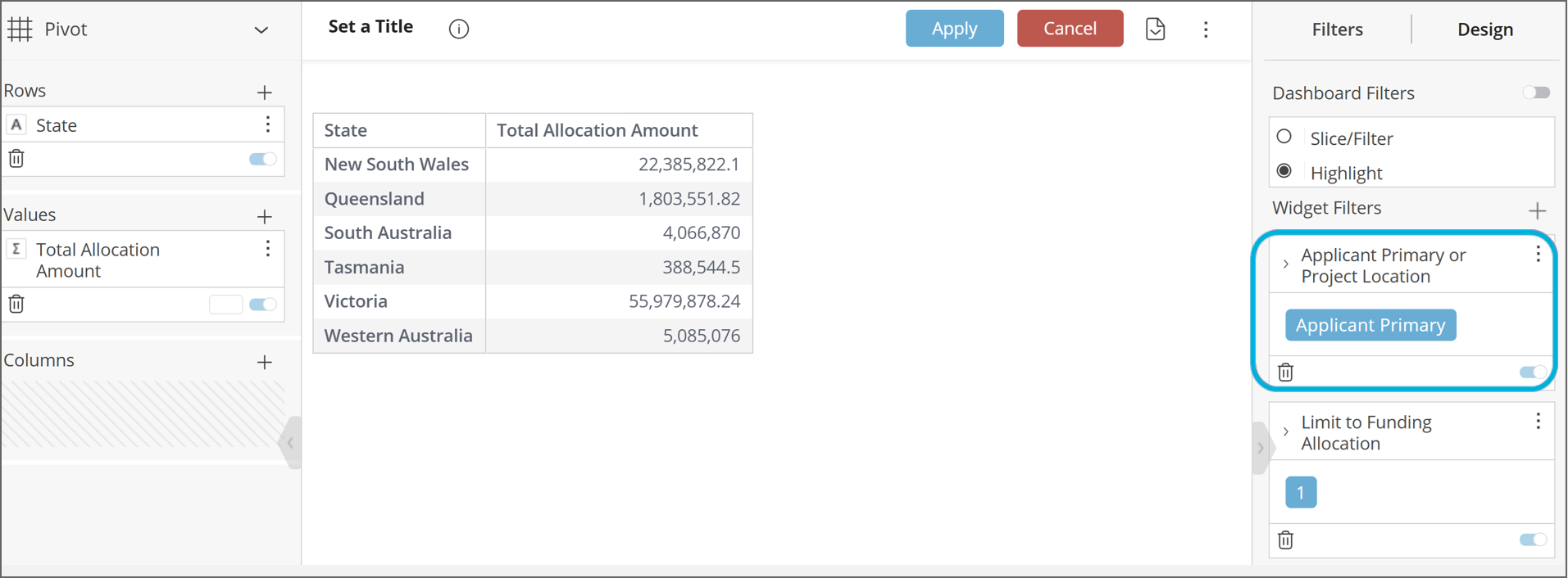
Important: When using boundary fields to group data, apply “Applicant Primary or Project Location” from the Location table as a widget filter.
Each application has only one Applicant Primary address but may have several Project Location addresses. When using boundary fields from the Location table to group data, the association of an application with multiple addresses may lead to double counting. For example, if an application has both an Applicant Primary and a Project Location address in the state of Victoria, this may lead to the application’s funding being attributed to Victoria twice.
Since an application only ever has one Applicant Primary address, filtering for “Applicant Primary” removes any double counting (see image below).
If you do need to aggregate funding based on the Project Location, you can use a custom formula in the Values box in the left-hand toolbar of the widget builder. Refer to the section "Important: If the ‘Applicant Primary or Project Location’ filter includes Project Location addresses, apply a custom formula" within Section 14 ('Location data and maps') of the technical documentation, for more detailed information.
There are 2 types of maps that can be created in Analytics: Scatter maps (showing 'pins' where individual Applicant Primary / Project locations are located) and Heat maps (showing areas or boundaries where Applicant Primary / Project location addresses fall into). In addition, multi-layered maps can be built enabling you to layer scatter points on top of a heat map. Instructions for creating these are below.
Configuring Project Locations to appear on maps
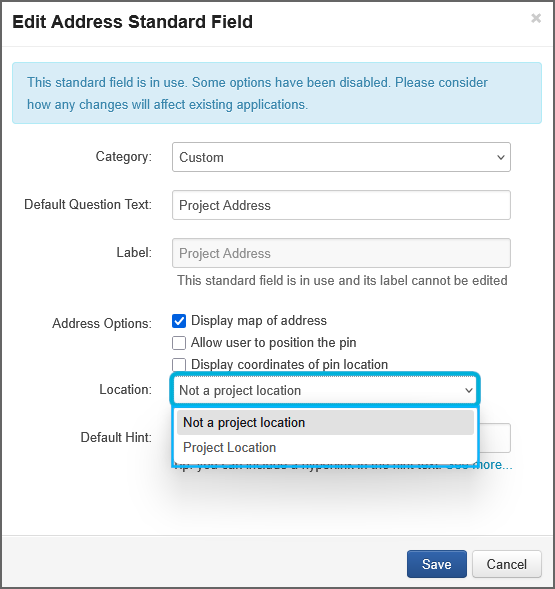
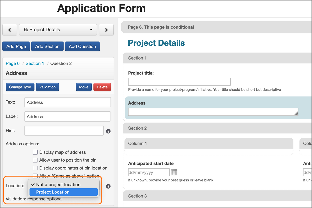
A Project Location will only appear on a map if the address question has been specified as a Project Location. The question types that may be specified as a Project Location include Standard Fields, Contact Fields and Single Questions.
For Standard Fields, this is done when creating/editing the standard field under Account Settings:
For Contact Fields and Single Questions, this is done when adding the address question to the form in the form editor:
Important information for users transitioning from SmartyMaps:
Any Standard Fields previously specified as Project Locations will no longer appear on a map visualisation. To resolve this:
Review and update any (Address) Standard Fields in your account settings (as per the above screenshot) to specify them as Project Locations where relevant.
They will then appear in map visualisations.
This information only applies to Standard Fields. Project Locations configured previously as Contact Fields and Single Questions are not impacted.
Scatter maps
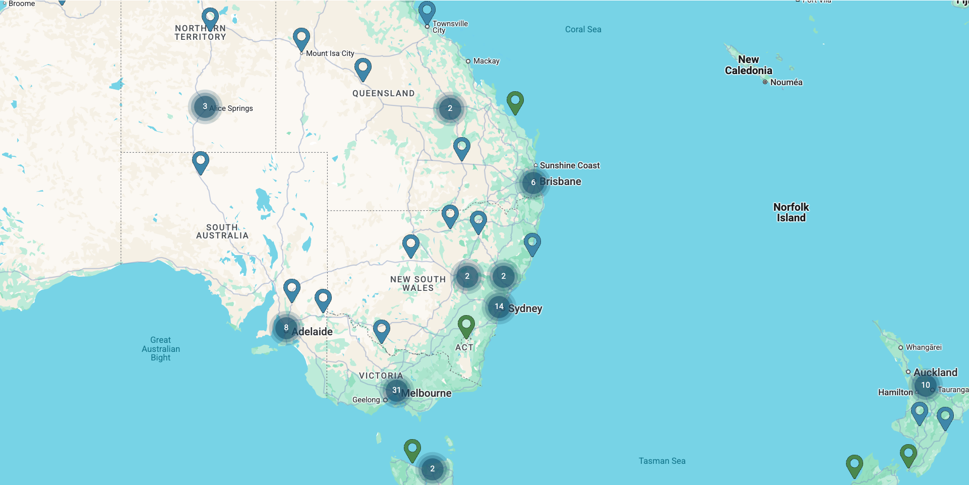
Scatter maps can be used to visualise the points where addresses are found on a map, as well as aggregations associated with each point. If there are multiple points located close together, they will be grouped together in a cluster. In the below map, for example, there are 14 addresses near Sydney clustered together and 31 addresses near Melbourne clustered together:
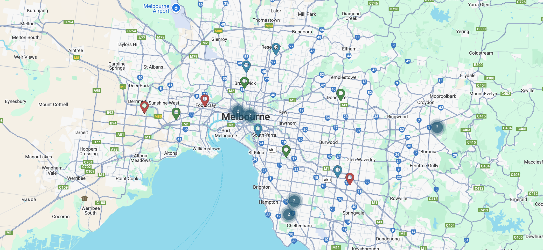
Zooming into Melbourne separates out the individual addresses located in or around this city:
Note: If an application has multiple addresses on the map, clicking on a scatter point will cause the map to only display one address (the address that was clicked on).
Interpreting the colours of pinpoints and clusters
The colour of clusters is not configurable.
The colours of individual pinpoints can be set by specific rules when building the scatter map (see instructions below).
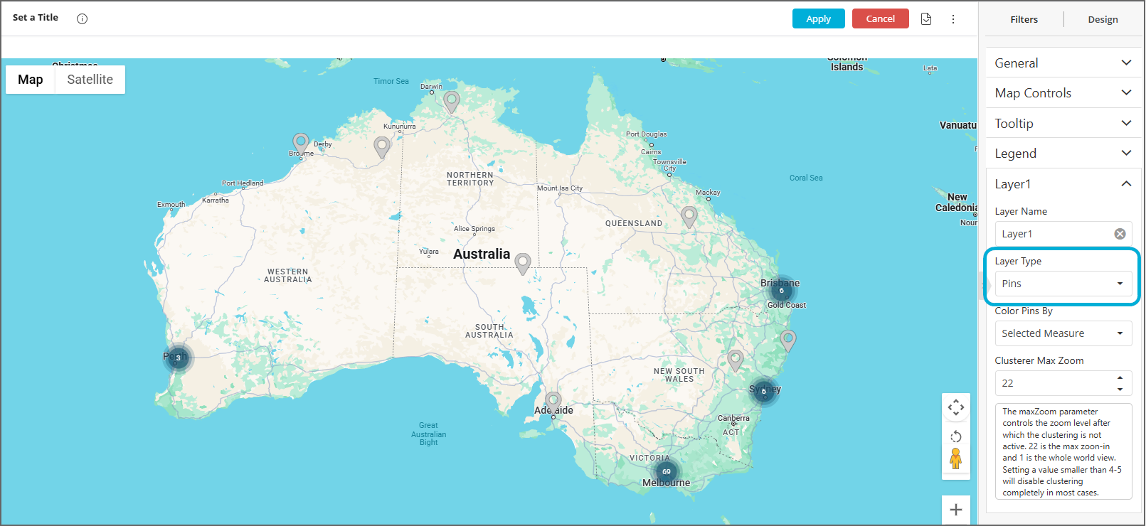
To create a scatter map
Firstly, select + Select Data to select any attribute (for example Instance ID). This data isn't used in the map, but it's necessary to select something in order to be able to proceed to the Advanced configuration and create a map.
Select Advanced Configuration at the bottom left of the screen.
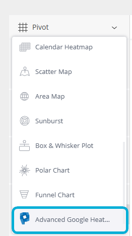
In the left-hand pane, change the widget type dropdown from Pivot to Advanced Google Heatmap:
In the right-hand sidebar, expand Layer1 and ensure Layer Type is set to Pins. This will generate a scatter map showing the points where addresses fall on a map:
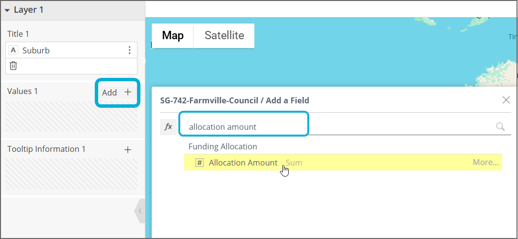
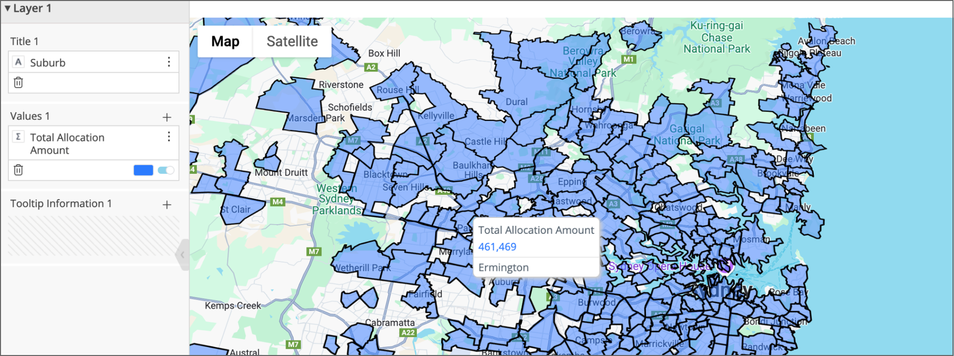
In the left-hand sidebar, add a field that you would like to aggregate (e.g. sum, average) per point to the Values 1 box, such as 'Allocation Amount' and click Apply:
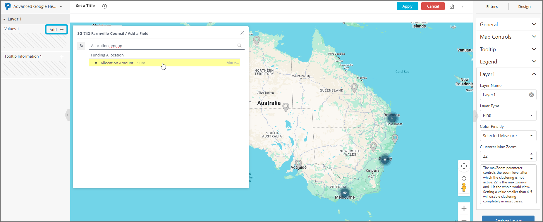
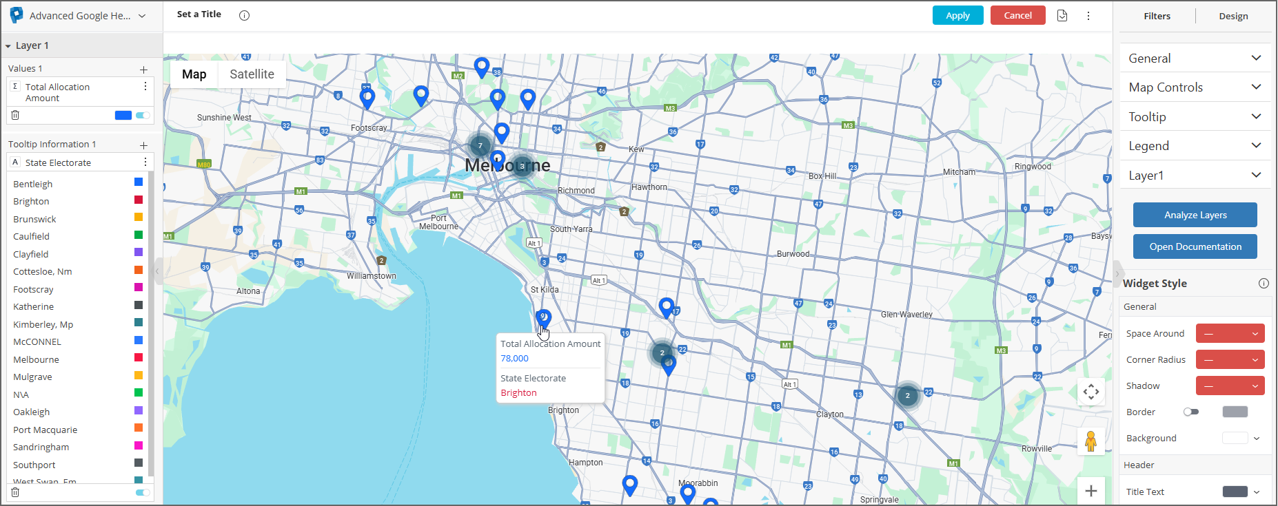
In the image below, “Allocation Amount” from the Funding Allocation table has been added to the Values 1 box. When a mouse hovers over an address, the tooltip now shows the total funding allocation amount associated with the application that listed this address as an Applicant Primary or Project Location address:
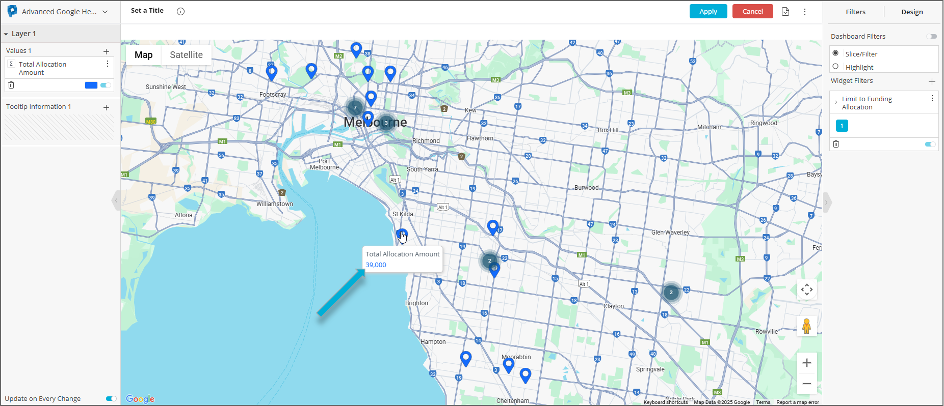
Don’t forget to add a Limit To widget filter as usual (in the above screenshot it's 'Limit to Funding Allocation').
To add other information to the tooltip that appears when hovering over an address, add a field to the Tooltip Information 1 box in the left-hand sidebar:
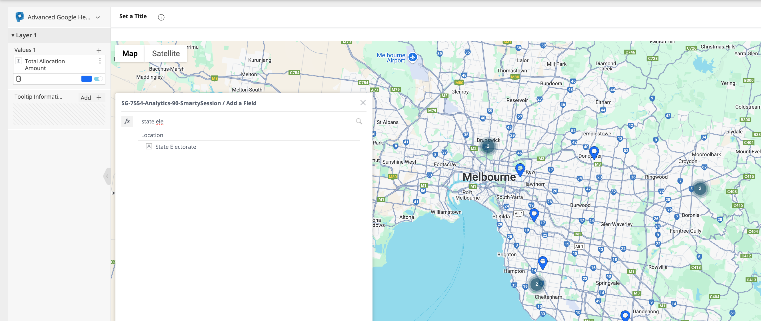
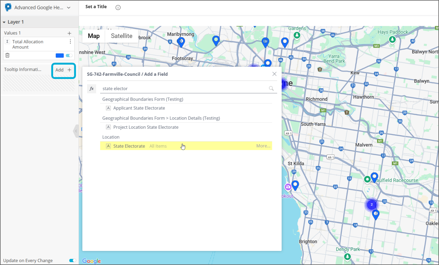
In the image below, “State Electorate” from the Location table has been added to the Tooltip Information 1 box. When a mouse hovers over an address, the tooltip now also specifies the state electorate associated with it:
You can set rules for determining the colours of pinpoints:
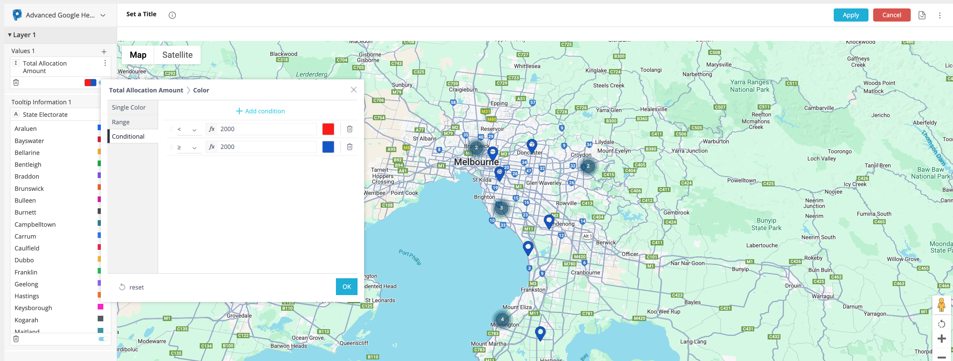
a) If you would like the colour of a pinpoint to be based on the value it is aggregating, click on the small box in the bottom right of the Values 1 box. Selecting Range will colour pinpoints along a gradient, while selecting Conditional allows for the input of more specific rules. In the example below, a pinpoint will be red if more than (or equal to) $20,000 in funding has been allocated to the application associated with this address, or blue if it's less than $20,000:
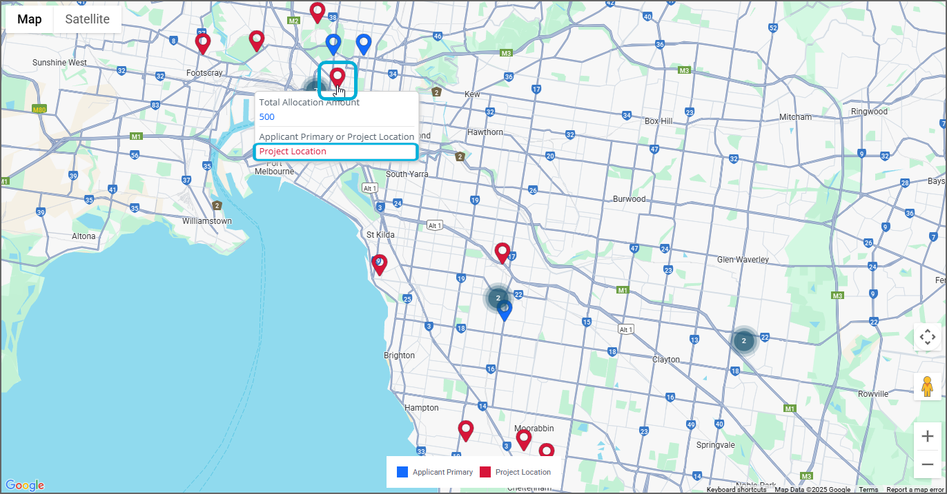
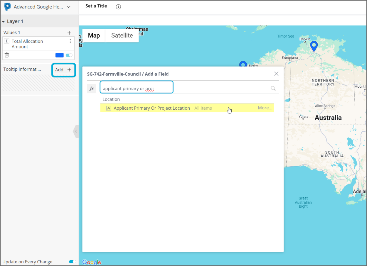
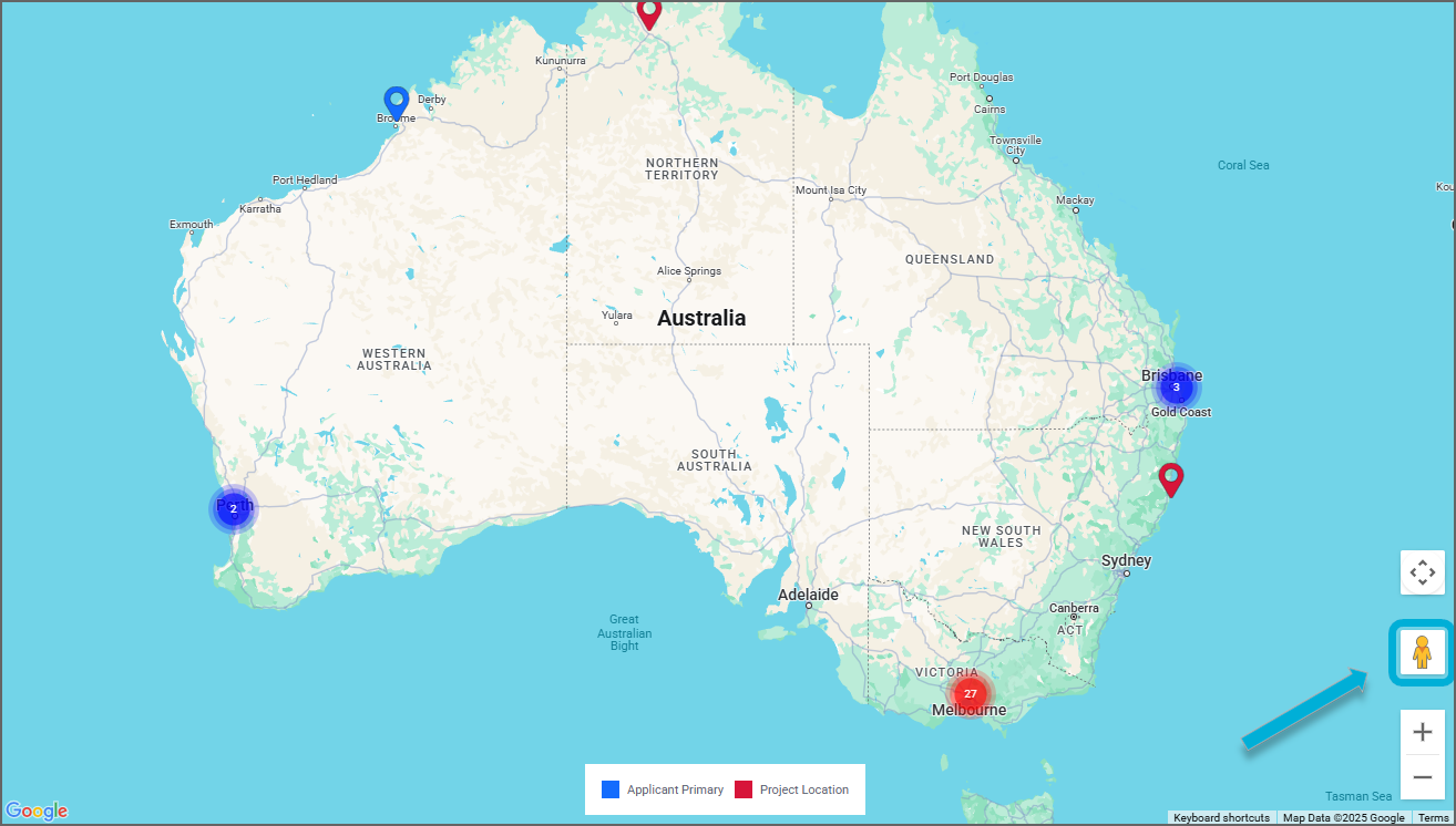
b) You can also colour a pinpoint by a non-numerical attribute. In the example below, red pinpoints signify a Project Location while blue pinpoints signify an Applicant Primary location:
To achieve this:
i) Add the relevant grouping field to the Tooltip Information box. In this example, add “Applicant Primary or Project Location”:
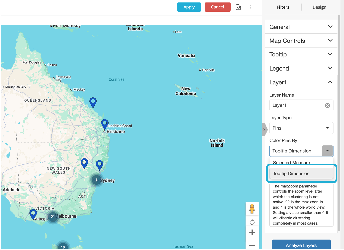
ii) Then, in the right-hand sidebar, expand Layer1, select the Colour Pins By dropdown and select Tooltip Dimension:
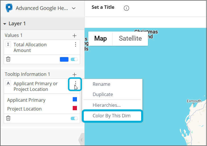
iii) Under Tooltip Information 1 in the left-hand side bar, select the three dots menu icon and select Color By This Dim:
Overlapping addresses
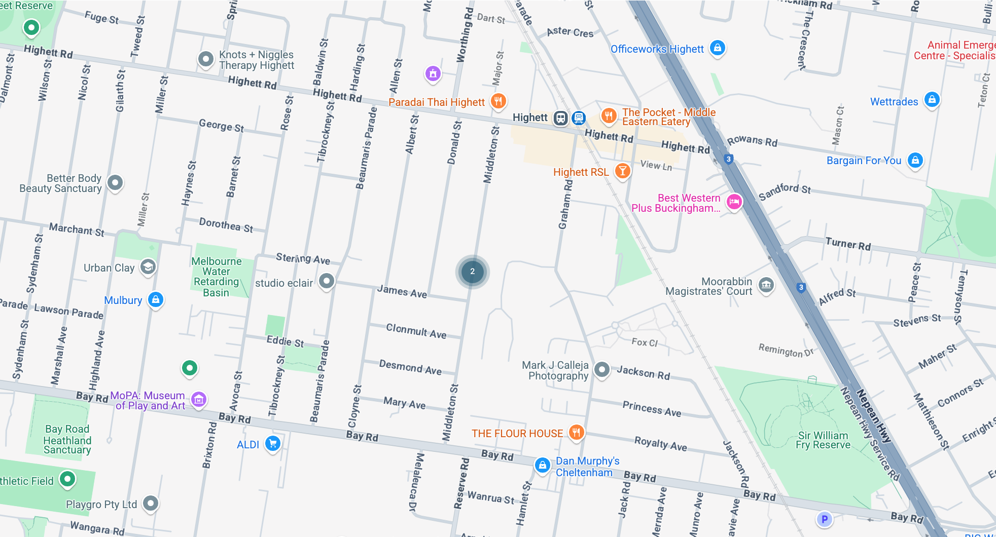
If more than one application has listed the same address as an Applicant Primary or Project Location, these addresses will be clustered and cannot be separated out into pinpoints, no matter how far you zoom in:
Heat maps
Heat maps can be used to visualise data associated with areas or boundaries where Applicant Primary / Project Location addresses fall. The heat map below visualises funding allocations by state, for example, with darker shading indicating that Victoria receives more funding compared to other states. Hovering over a state generates a tooltip showing the amount of funding allocated to applications whose Applicant Primary / Project Location addresses fall in the state:
To create a heat map
Firstly, select + Select Data to select any attribute (for example Instance ID). This data isn't used in the map, but it's necessary to select something in order to be able to proceed to the Advanced configuration and create a map.
Select Advanced Configuration at the bottom left of the screen.
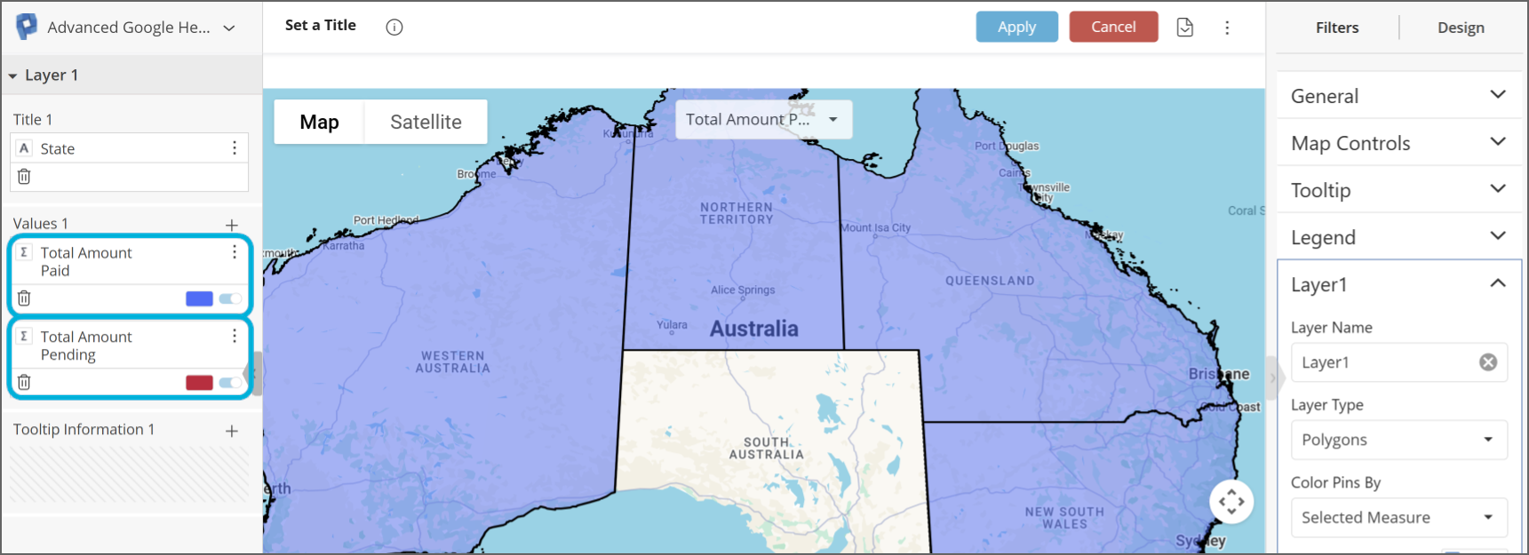
In the left-hand pane, change the widget type drop-down from Pivot to Advanced Google Heatmap.
In the right-hand sidebar, expand Layer1 and ensure Layer Type is set to Polygons.
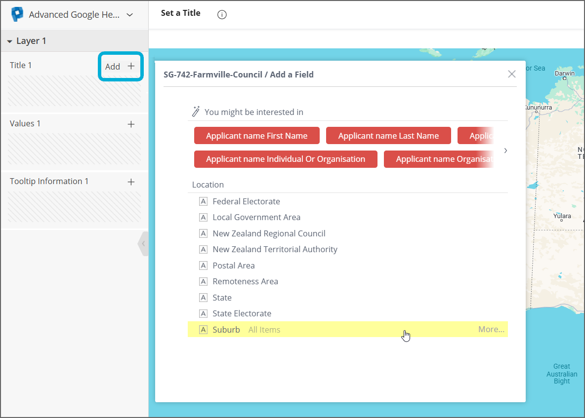
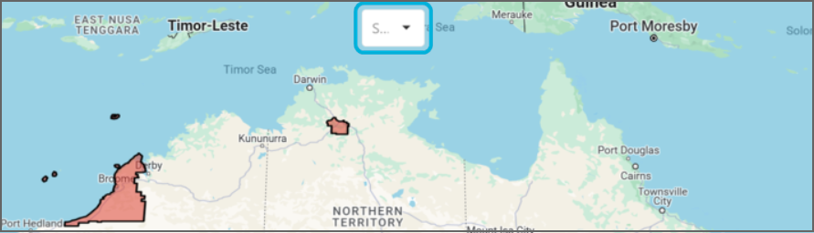
In the left-hand sidebar, click Add + in the Title 1 box which will generate a field selector. Select the boundary that you would like to visualise on your map. For example, if you want to show suburbs on the map, select Suburb from the field selector:
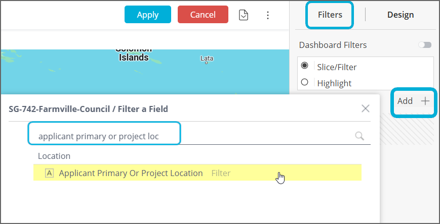
Since we are grouping data by a boundary, add Applicant Primary or Project Location as a widget filter to filter for either Application Primary or Project Location addresses (not both). To do this:
i) Select the Filters tab on the right-hand sidebar, then select the + sign to add a widget filter, type in applicant primary or project location and select it from the Location table:
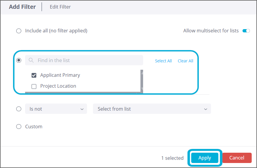
ii) Select either Applicant Primary or Project Location depending on which type of location you want to display in the map, and select Apply:
In the left-hand sidebar, add a field that you would like to aggregate (e.g. sum, average) per boundary to the Values 1 box:
If you are visualising Project Location addresses, remember to add a formula to remove double- counting resulting from applications having multiple project locations. To do this, refer to the section "Warning: if the “Applicant Primary or Project Location” filter includes Project Location addresses, apply a custom formula" within Section 14 ('Location data and maps') of the technical documentation.
In the image below, “Allocation Amount” from the Funding Allocation table has been added to the Values 1 box. When a mouse hovers over a suburb, the tooltip will show the amount of funding associated with applications whose Applicant Primary addresses fall within this suburb:
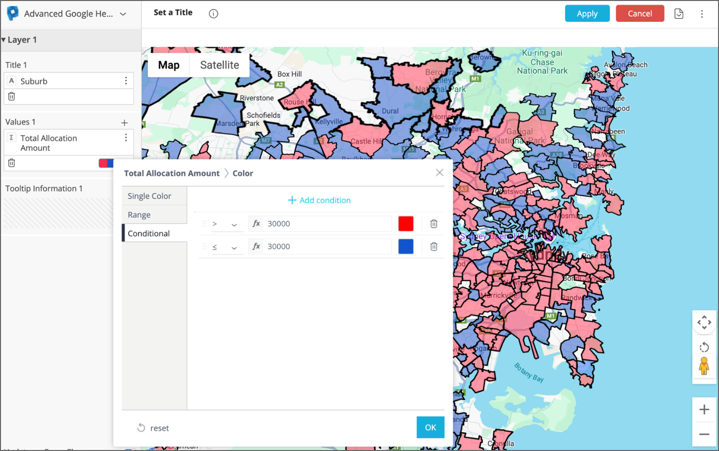
You can set rules for determining the colours of boundaries. If you would like the colour of a boundary to be based on the value it is aggregating, click on the small box in the bottom right of the Values 1 box. Selecting Range will colour pinpoints along a gradient, while selecting Conditional allows for the input of more specific rules. In the example below, a boundary will be red if more than $30,000 in funding has been allocated to applications whose Applicant Primary address falls within the boundary, otherwise it will be coloured blue:
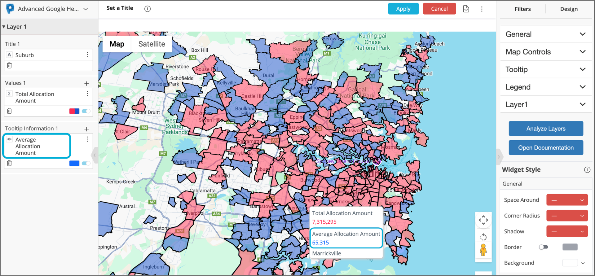
To add other information to the tooltip that appears when hovering over a boundary, add a field to the Tooltip Information 1 box in the left-hand sidebar. For example, in the image below, “Allocation Amount” from the Funding Allocation table (with the Average function applied) has been added to the Tooltip Information 1 box. When a mouse hovers over a suburb, the tooltip now also specifies the average amount of funding that an application typically receives in the suburb:
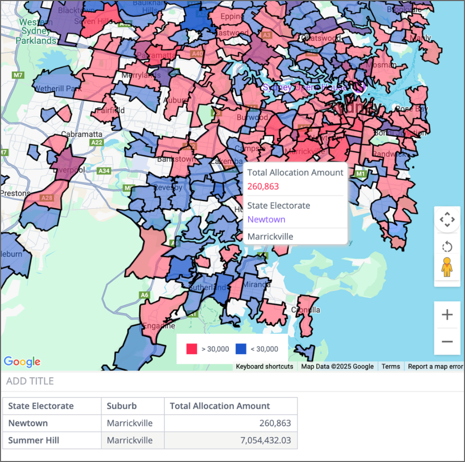
Important: When building a heat map, only add a field to the Tooltip Information box that has a unique value for every value in the Title box (a one-to-one relationship between the fields).
Example: A suburb can belong to multiple state electorates (there is not a one-to-one relationship between suburbs and state electorates). For example, the suburb of Marrickville is split between the state electorates of Newtown and Summer Hill. In a suburb heat map, it would not be advisable to add “State Electorate” to Tooltip Information 1. This is because the tooltip is only able to include one value per boundary. In the example of Marrickville, it would arbitrarily select Newtown or Summer Hill. This can also lead to inaccurate aggregation of figures in the tooltip.
Please note that among the boundaries in the Location table, there only exists one-to-one relationships between State and the other boundaries (for example, there is a one-to-one relationship between State and Postcode, but there is not a one-to-one relationship between Postcode and Suburb).
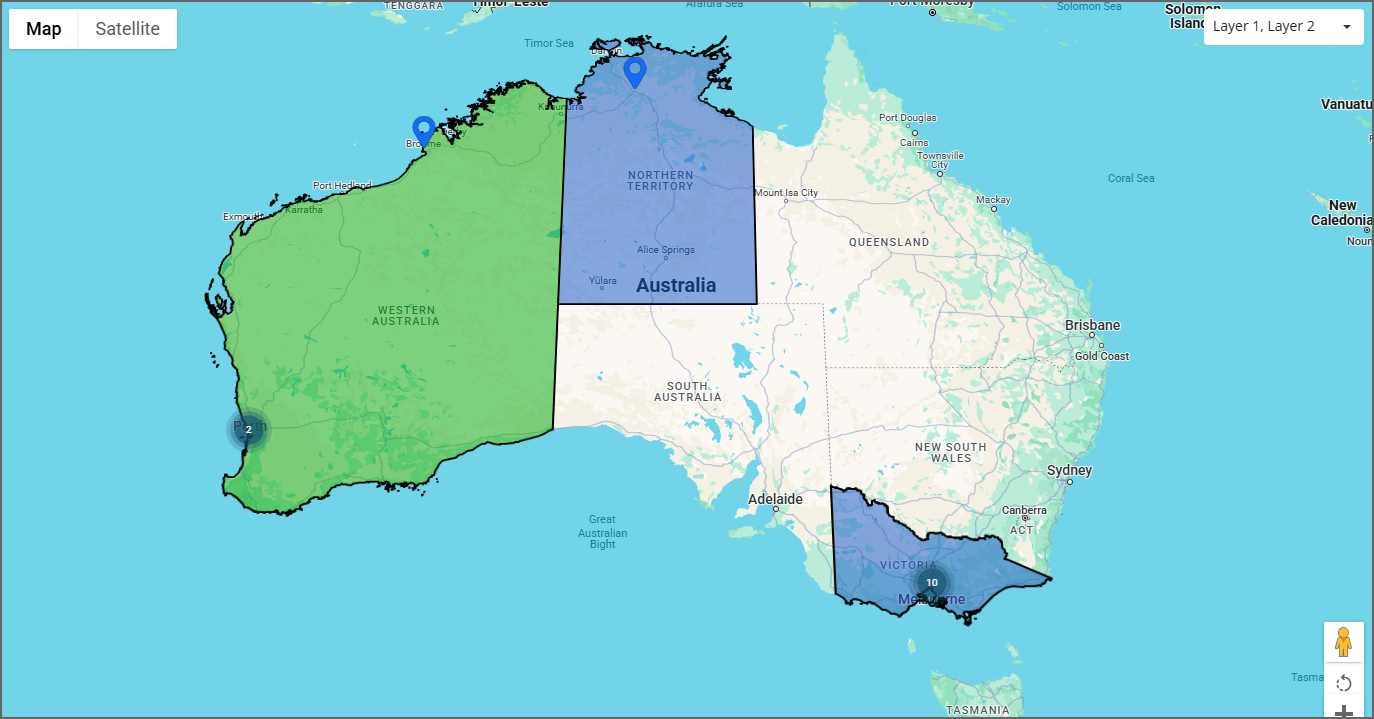
Multi-layered maps
The Advanced Google Heatmap allows you to layer scatter points on top of a heat map in a two-layer map. Two-layer maps allow you to toggle between:
seeing scatter points on top of a heat map,
seeing scatter points without a heat map, and
seeing a heat map without scatter points.
Creating a two-layer map (comprising scatter points on a heat map)
To create a two-layer map:
Firstly, select + Select Data to select any attribute (for example Instance ID). This data isn't used in the map, but it's necessary to select something in order to be able to proceed to the Advanced configuration and create a map.
Select Advanced Configuration at the bottom left of the screen.
In the left-hand pane, change the widget type dropdown from Pivot to Advanced Google Heatmap.
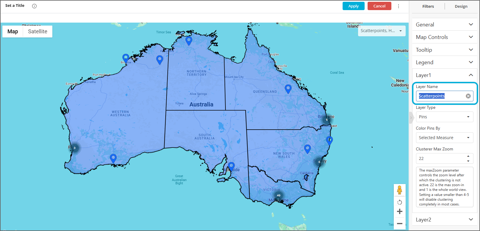
In the right-hand sidebar, expand General and select '2' for Number of Layers:
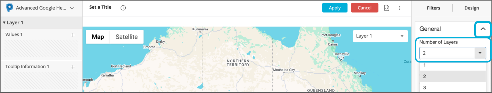
This adds a second section 'Layer 2' to both the right-hand and left-hand sidebars:
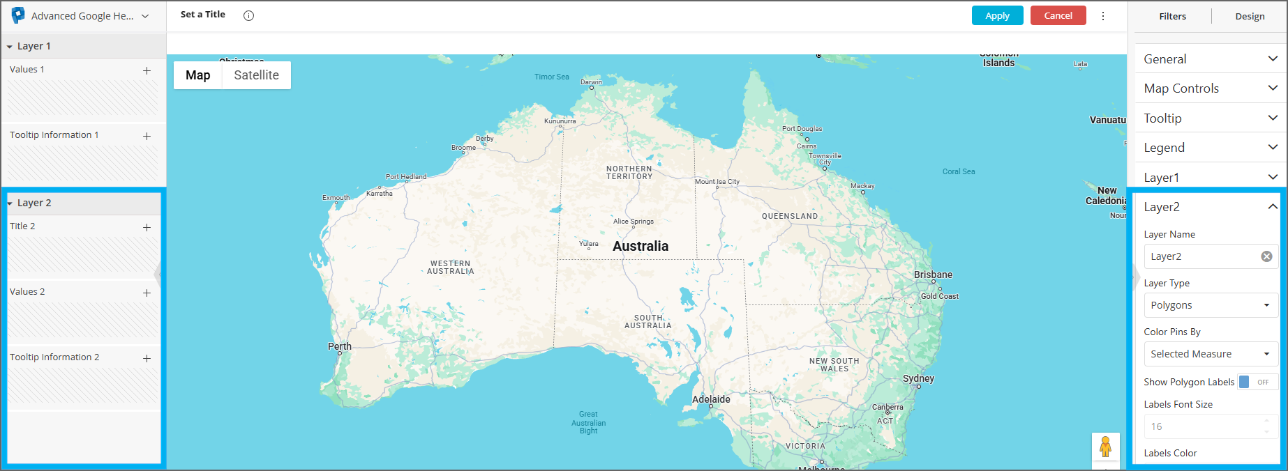
In the right-hand sidebar, expand Layer1 and set Layer Type to Pins and
follow the earlier instructions for creating a scatter map in the Layer 1 section of the left-hand
sidebar.In the right-hand sidebar, expand Layer2 and set Layer Type to
Polygons, then follow the earlier instructions for creating a heat map in the Layer 2
section of the left-hand sidebar (populate Title 2, Values 2, Tooltip Information 2).You can rename the layers in the right-hand sidebar to make it easier to identify layers in the drop-down menu:
Apply your changes and exit the widget builder to view the dashboard.
Note: whilst in widget Edit mode, only the contents of one layer is displayed at a time. To change the layer displayed whilst in widget Edit mode, exit to the dashboard and select the desired layer using the dropdown selector and then re-enter the widget builder.
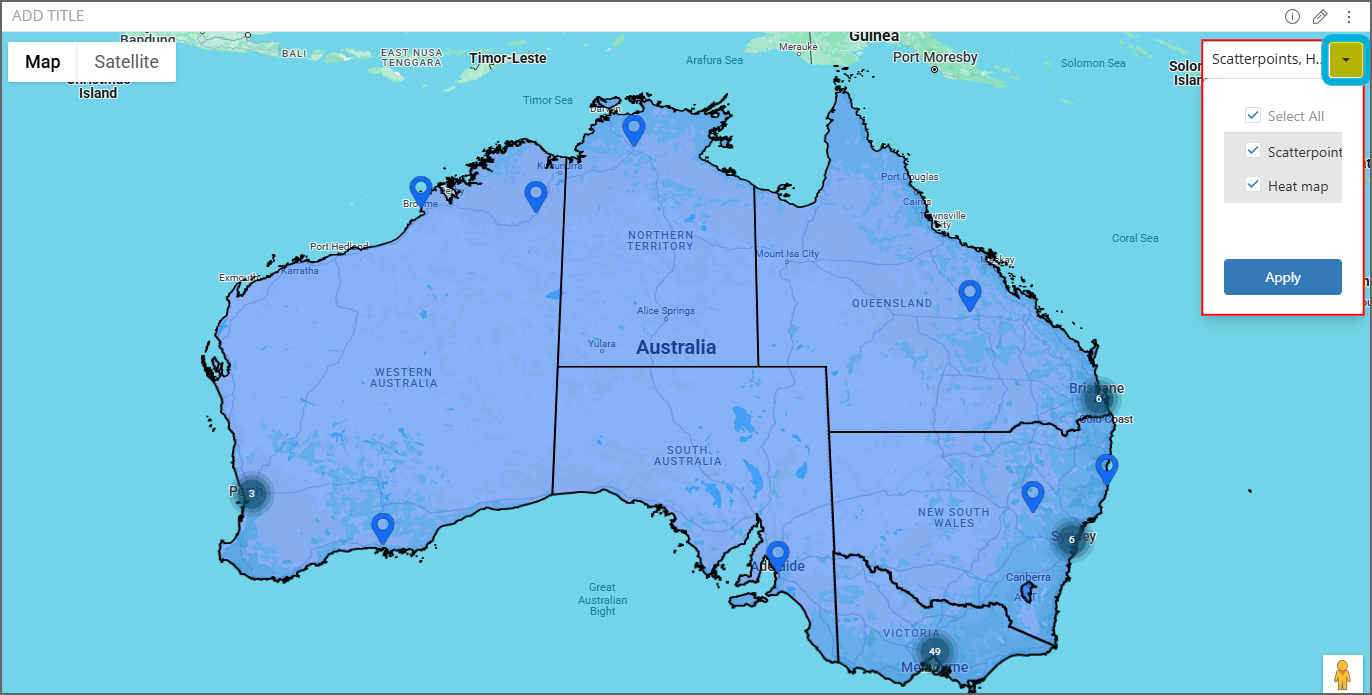
Viewing a multi-layered map
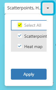
While viewing the map widget in the dashboard, ensure Layer 1 and Layer 2 are both ticked in the top right dropdown box to visualise both layers at once:
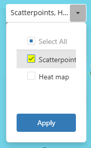
If you want to toggle between seeing the heat map without scatter points or vice versa, tick only one layer:
Multiple values in a single-layer map
In a single-layer map, it is possible to enable views to toggle between different fields to be
aggregated. In the map below, for example, a user can toggle between a map showing
the sum of paid payments per state and a map showing the sum of pending payments
per state.
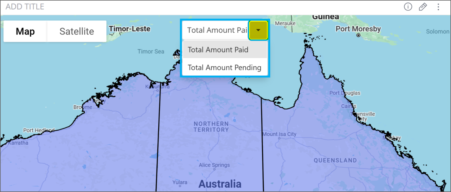
To achieve this, simply add more than one field to the Values 1 box in the left-hand side
bar when building a widget. This will generate a drop-down menu at the top of the map to toggle between the fields to be aggregated. Note that this menu can only be interacted with
when viewing the dashboard (once exited the widget builder):
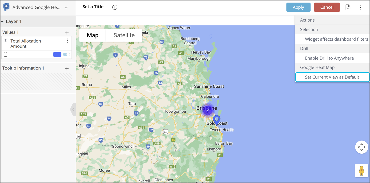
Default load view
If you would like a map widget to always load centred on a certain location, in the widget builder move the map to that location. Then, in the top right-hand corner, click on the three dots to generate a drop-down menu and select Set Current View as Default. In the below example, each time the map is refreshed, it will open centred on Brisbane:
Customising maps
Customise the look, style and functionality available to viewers of maps you build in the right-hand toolbar.
Map Controls
Expand Map Controls to customise the placement of buttons on the map and disable functionality for the viewer:
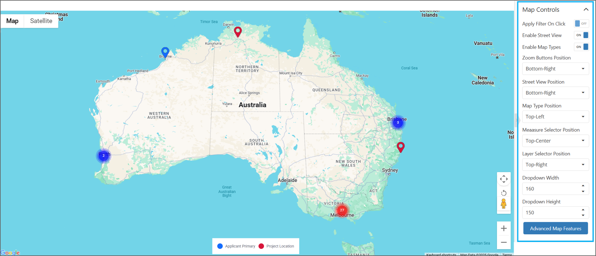
Apply Filter On Click: toggle On/Off - enables interactive filtering on a map (see Using map as a filter).
Enable Street View: toggle On/Off - governs whether the Pegman is displayed.
Enable Map Types: toggle On/Off - governs if user can select between Map or Satellite view.
Zoom Buttons Position: the position of the zoom in (+) or zoom out (-) buttons.
Street View Position: the position of the Pegman.
Map Type Position: the position of the map selector (to select between Map or Satellite).
Measure Selector Position: the position of the measure selector.
Layer Selector Position: the position of the layer selector.
Dropdown Width + Dropdown Height: these control the size of the Layers / Values drop-down menu in the map. For example, setting Dropdown Width to 50 here makes the drop-down quite narrow:
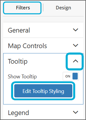
Tooltip Styling
Expand the section Tooltip and select Edit Tooltip Styling to customise options for the Title and Tooltip:
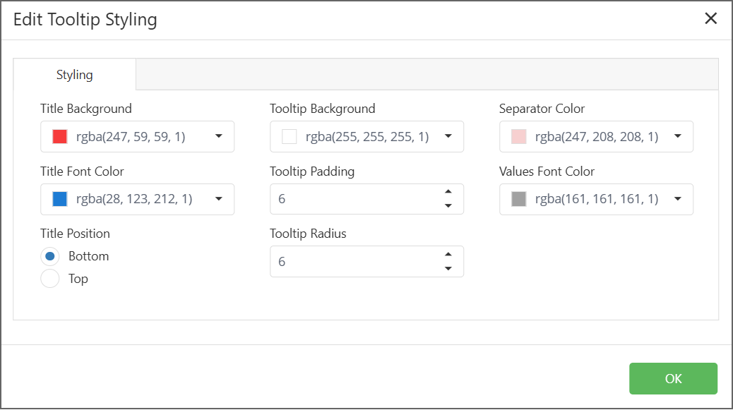
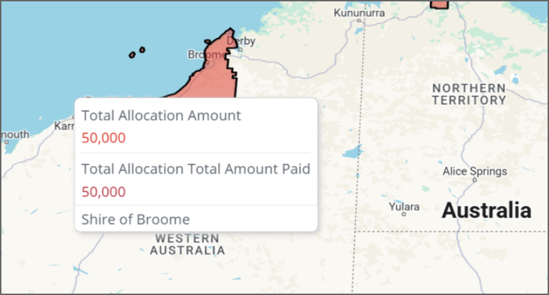
Title Background + Title Font Color: this determines the font / background of the part of the tooltip that shows the boundary name. The Shire of Broome box here is the Title, you can change the background colour and font colour of it:
Title Position: Bottom/Top
Tooltip Background: the colour of the tooltip box background (by default it's white).
Tooltip Padding: the number of pixels to allow for padding around the text and the border of the tooltip box.
Tooltip Radius: the radius of the corners of the tooltip box.
Separator Color: the colour of the line separating the data items in the tooltip box.
Values Font Color: the colour of the value amounts displayed in the tooltip.
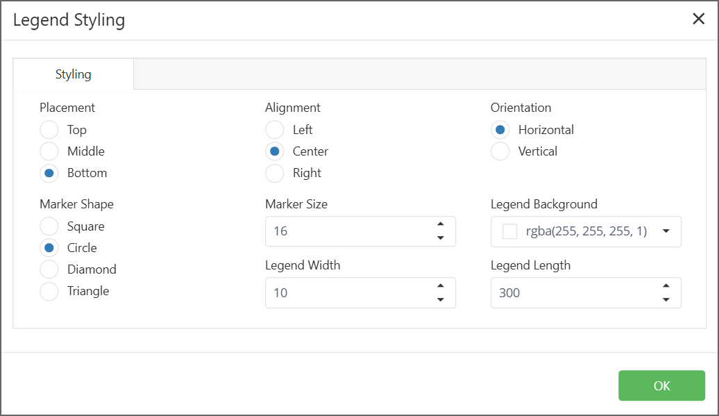
Legend Styling
Expand Legend and select Legend Styling to customise the placement, size etc. of legends:
Using a map as a filter
Under Map Controls, turning on Apply Filter On Click enables interactive filtering on a map. This means in a dashboard:
If a user clicks on a boundary in a heatmap, this will automatically filter the rest of the dashboard to only include data from the boundary
If a user clicks on a pinpoint in a scatter map, this will automatically filter the rest of the dashboard to only include data for the application associated with the pinpoint.
Google Streetview
The Advanced Google Heatmap has a Google Streetview functionality that allows viewers to see the street view associated with a pinpoint, or any other part of a map. To use this function, drag the yellow Pegman in the bottom right-hand corner of a map onto a point on the map:
Troubleshooting maps
Dashboard filters can prevent the map from loading – if the map is sitting there loading for a long time, select Apply to exit the widget editor and then remove any dashboard filters.