Analytics default dashboards

Analytics is a reporting tool embedded within SmartyGrants. It allows you to create, monitor, and export live dashboards that visualise data about your grants.
This article describes the default reporting dashboards available to you. Before reading this article, please ensure that you are familiar with the Analytics overview page.
Table of contents
Tip: If you wish to modify any of the default dashboards, duplicate it first and then edit your copy.
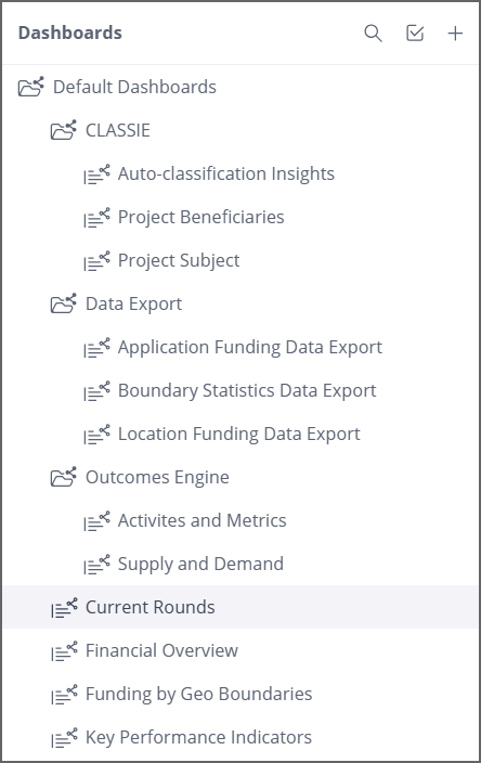
Locating the default dashboards
Navigate to Analytics via the reporting icon in the top navigation bar.

In the left-hand dashboard management panel, locate the folder titled Default Dashboards. Each will be pictured and described in further detail below. Simply select the particular dashboard that you wish to explore.
Tip: Click on any of the images in this article to make them larger.
The Analytics default dashboards
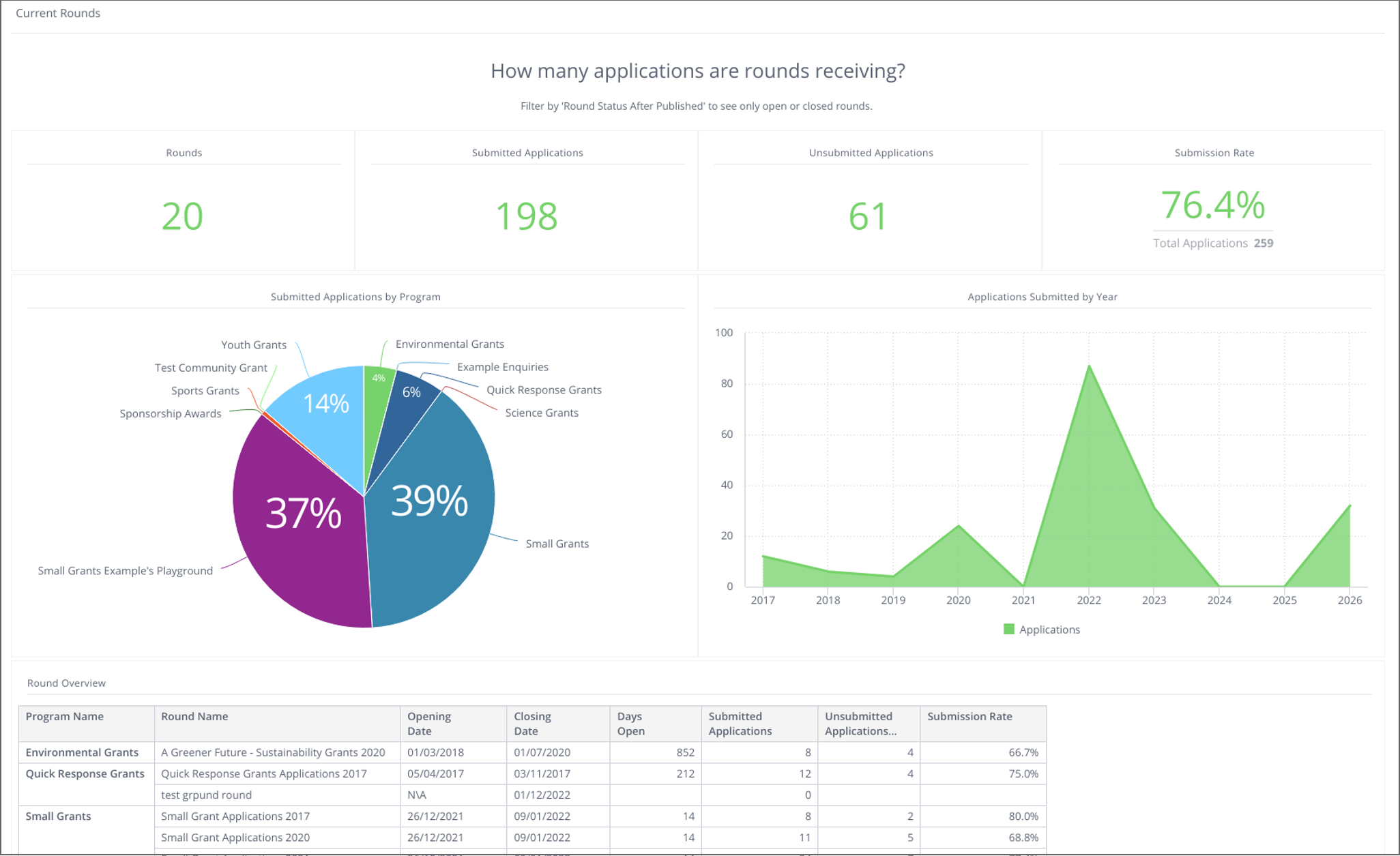
Current Rounds
This dashboard provides a high-level snapshot of the current rounds in your grantmaking account. It includes a chart of Submitted Applications by Program, as well as Applications Submitted by Year. You may wish to filter this dashboard to look at a specific program, round, or time period.
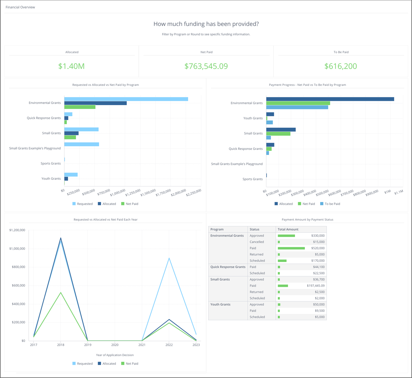
Financial Overview
This dashboard provides a high-level overview of financials across your grantmaking account. It includes total funds allocated and paid, as well as breakdowns of this per grant program and per financial year. You can filter this dashboard to be program or round-specific.
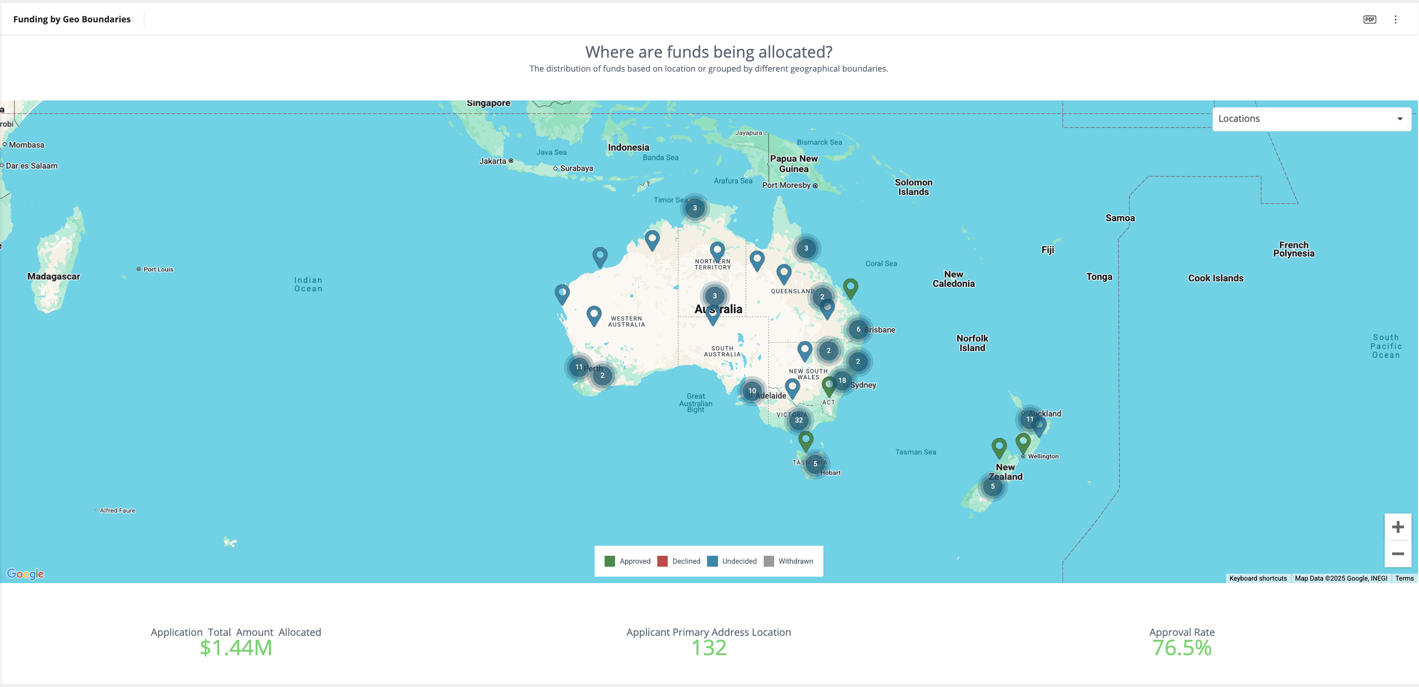
Funding by Geo Boundaries
This dashboard contains a map that visualises the applicant primary addresses and the project locations as well as where funds are being allocated based on different geographical boundaries. Below the map are some aggregated metrics for the locations being shown on the map. Hover over boundary shapes or location pins to see more information. Use the drop-down in the top right of the map to select different boundaries to display on the map.
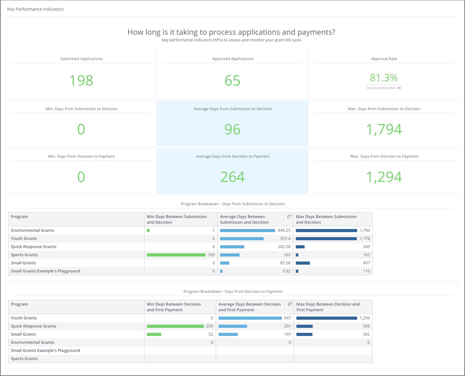
Key Performance Indicators
This dashboard contains helpful information on your overall grantmaking process including your rate of approval, how long it takes for a decision to be made on an application, and how long from the decision it takes for a payment to be made. You can filter this dashboard as needed.
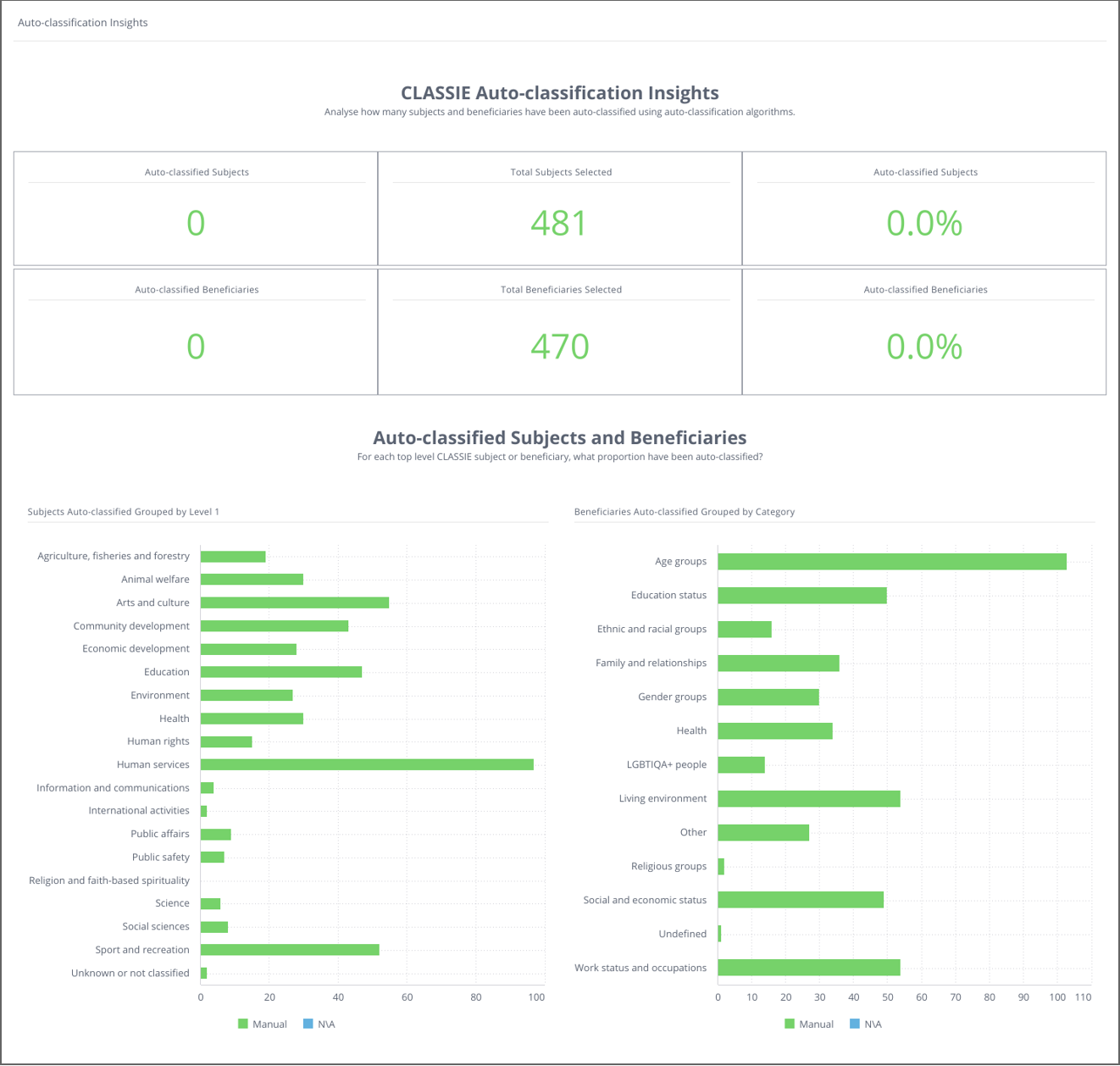
CLASSIE: Auto-classification Insights
This dashboard can be used to gain insights into how CLASSIE auto-classification is working in your account. The dashboards show the proportion of selected CLASSIE projects and beneficiaries that have been manually selected or selected by auto-classification. Filter by program or round to gain more specific insights.
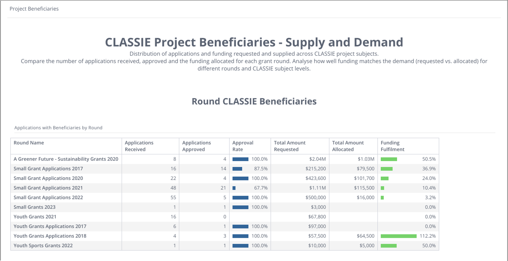
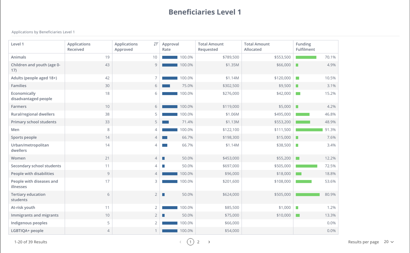
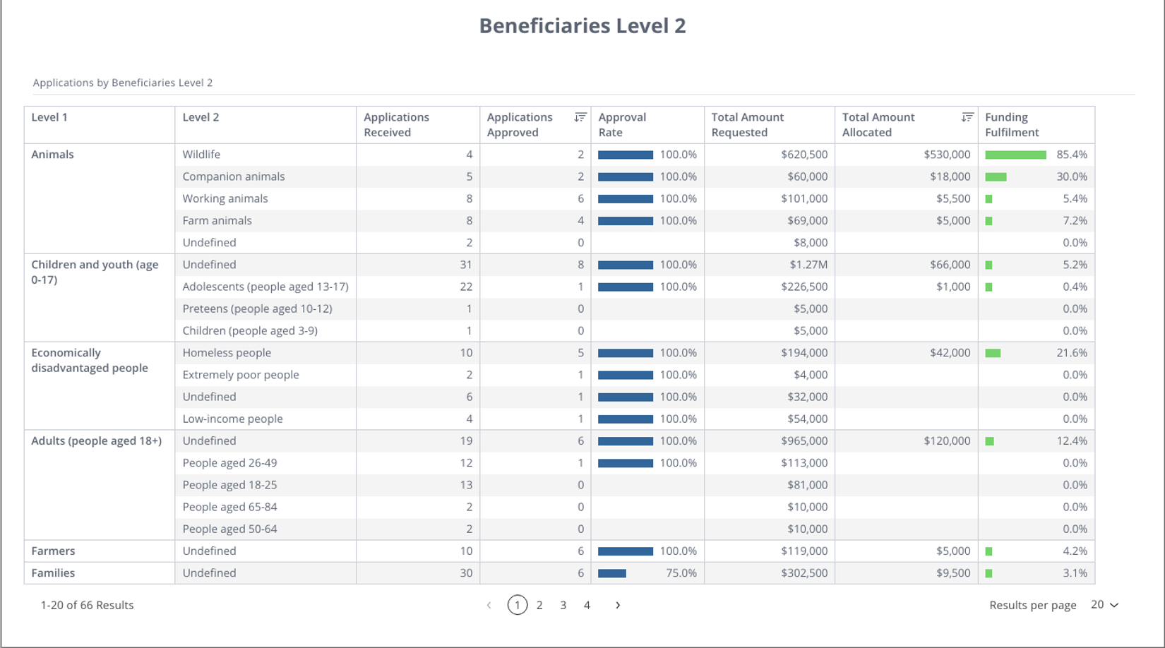
CLASSIE: Project Beneficiaries
This dashboard shows the distribution of applications and funding for applications that have a CLASSIE Beneficiary selected. The table Round CLASSIE Beneficiaries shows which rounds applications belong to and the Approval Rate and Funding Fulfilment (approval rate by amount). The tables Beneficiaries Level 1 and Beneficiaries Level 2 show the same metrics grouped by CLASSIE Beneficiaries Level 1 and Level 2. The dashboard can be filtered by program and round as well as Beneficiary choices.
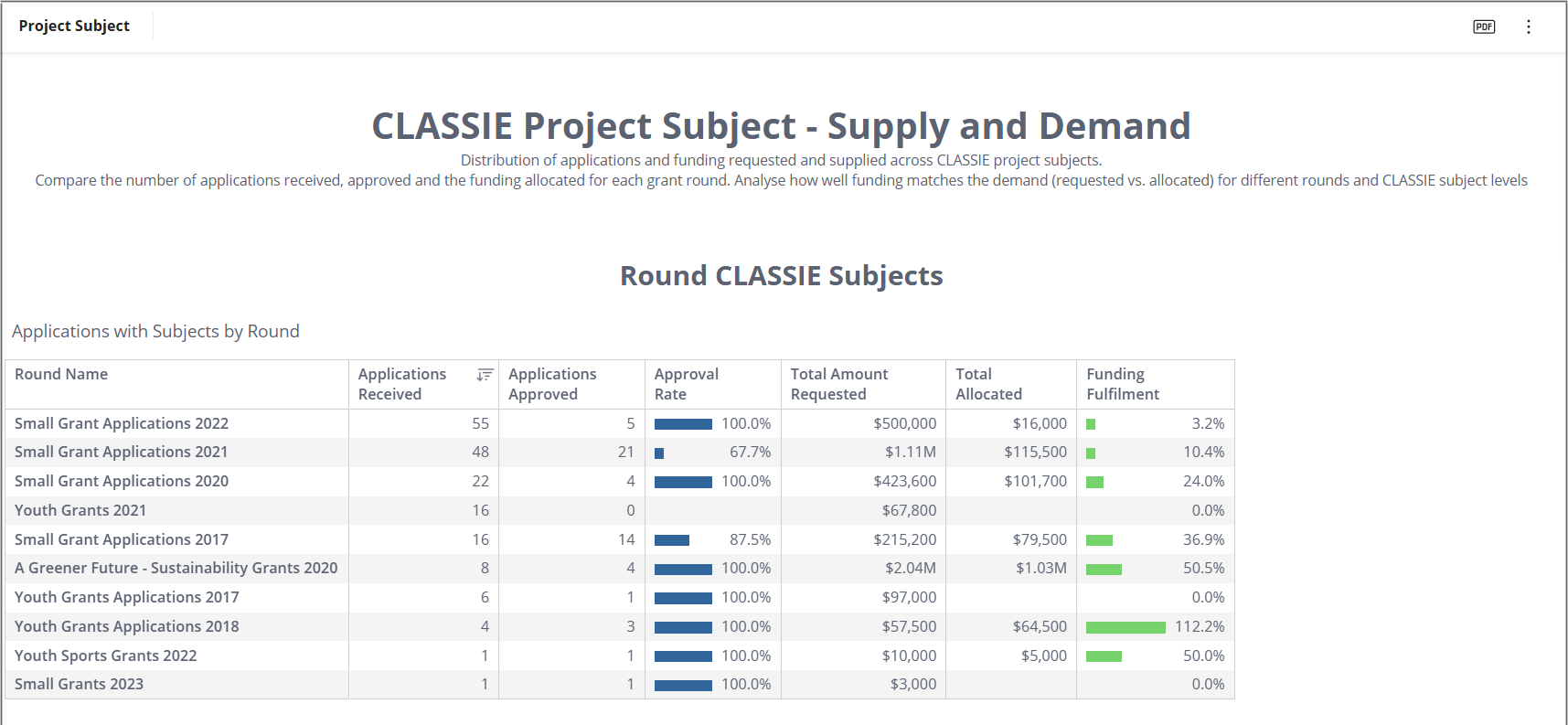
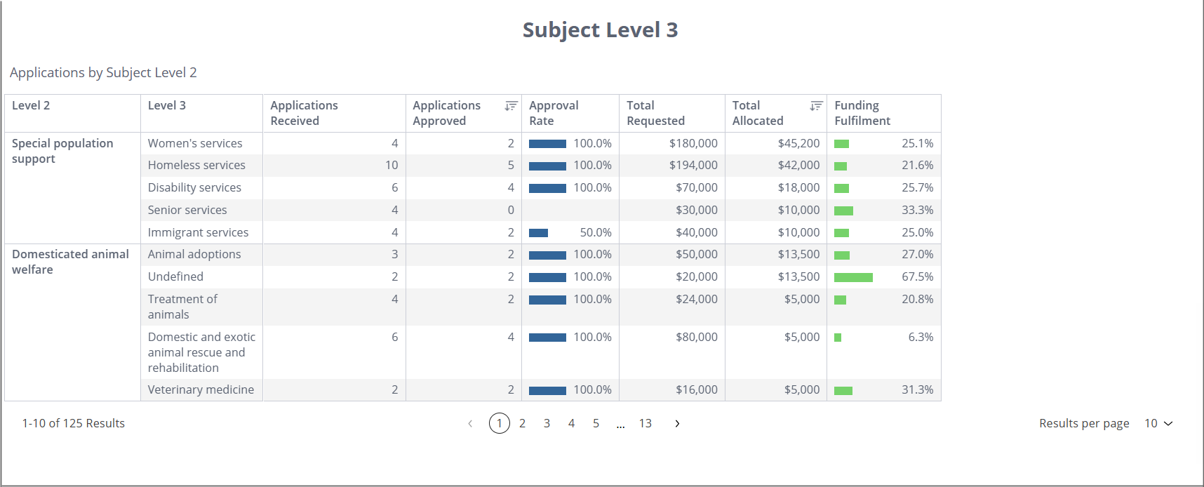
CLASSIE: Project Subject
This dashboard shows the distribution of funding for applications that have a CLASSIE Subject selected. The table Round CLASSIE Subjects shows which rounds applications belong to and the Approval rate and Funding Fulfilment grouped by round.
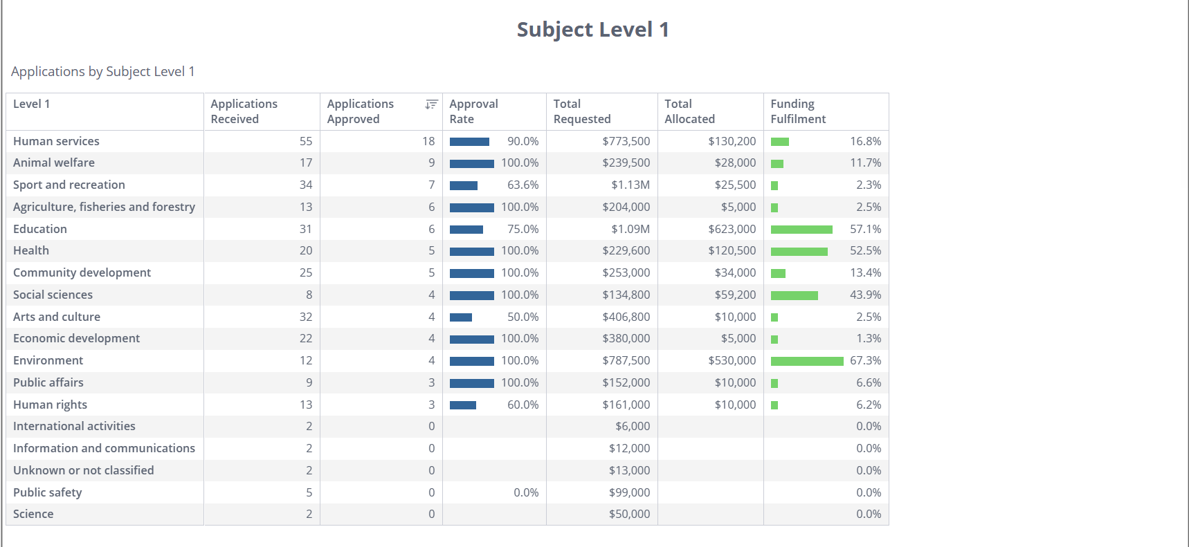
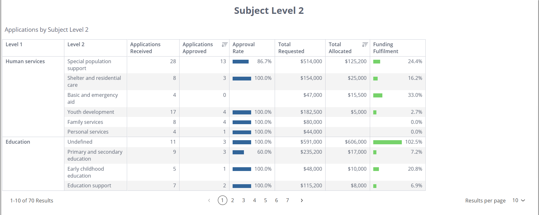
The tables Subject Level 1, Subject Level 2 and Subject Level 3 show the Approval Rate and Funding Fulfilment grouped by selected CLASSIE Subject choice. Where Subject Level 2 / Level 3 show ‘Undefined’, these are applications where a choice higher in the hierarchy was selected.
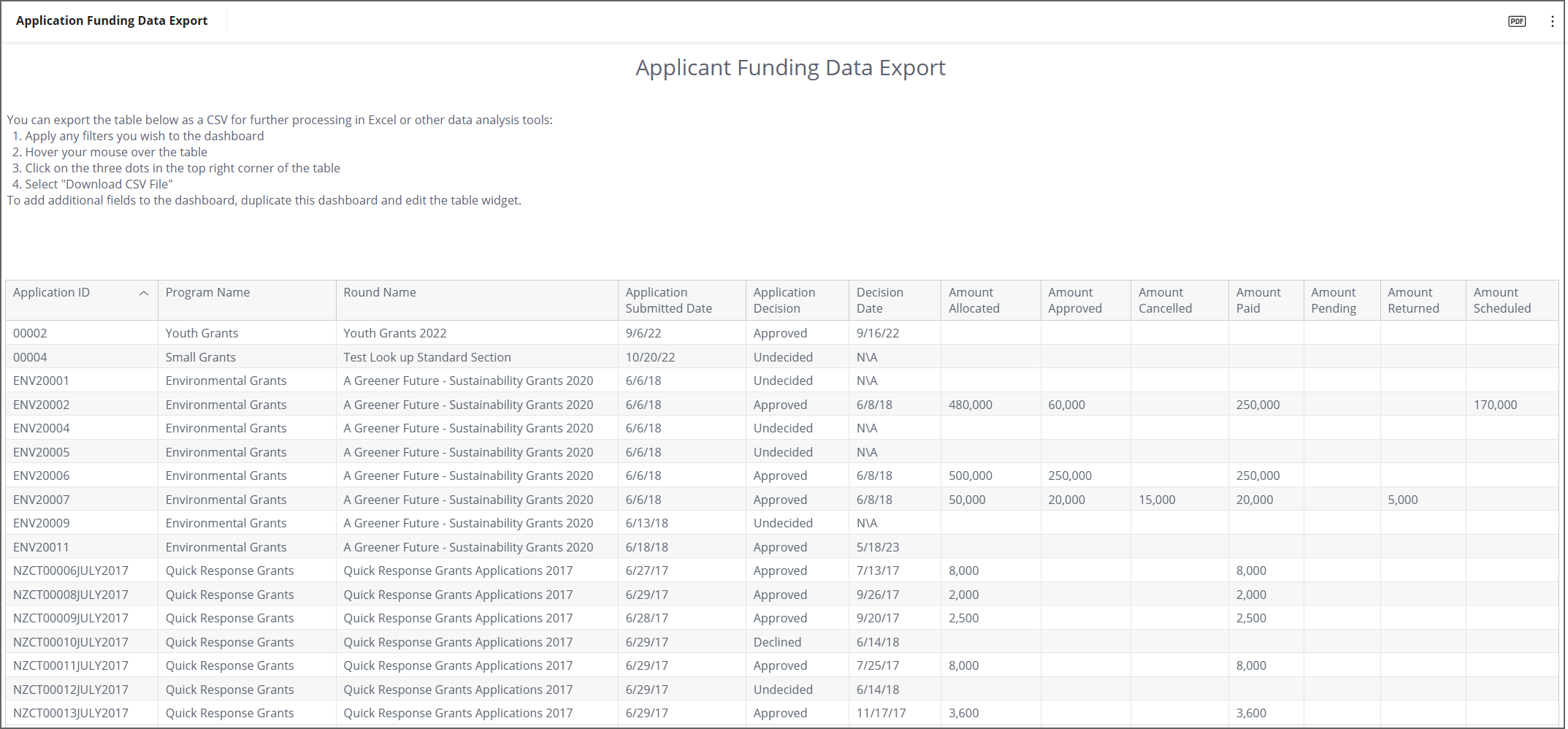
Data Export: Application Funding Data Export
This dashboard contains a table with basic application and financial details for each submission. The table can be exported as a CSV and further analysed in Excel or other data analysis tools. You may wish to filter this dashboard prior to downloading it. For example, filtering to Approved applications only.
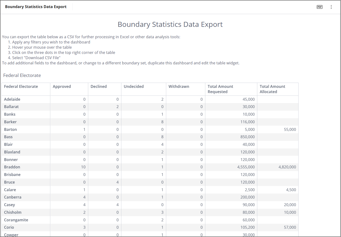
Data Export: Boundary Statistics Data Export
This dashboard contains a table showing aggregated values for Federal Electorates. The table can be exported as a CSV and further analysed in Excel or other data analysis tools. You may wish to filter this dashboard prior to downloading it. This dashboard can be duplicated and the Federal Electorate boundary replaced with any of the other boundary sets available in Analytics.
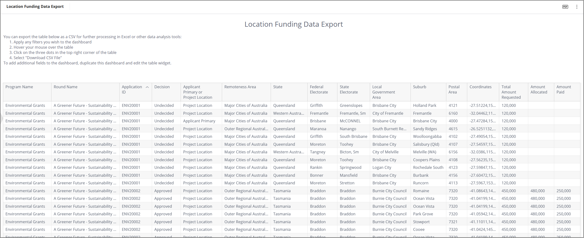
Data Export: Location Funding Data Export
This dashboard contains a table showing data for individual applicant primary and project locations. The table can be exported as a CSV and further analysed in Excel or other data analysis tools. You may wish to filter this dashboard prior to downloading it such as by program, round, or applicant primary or project location.
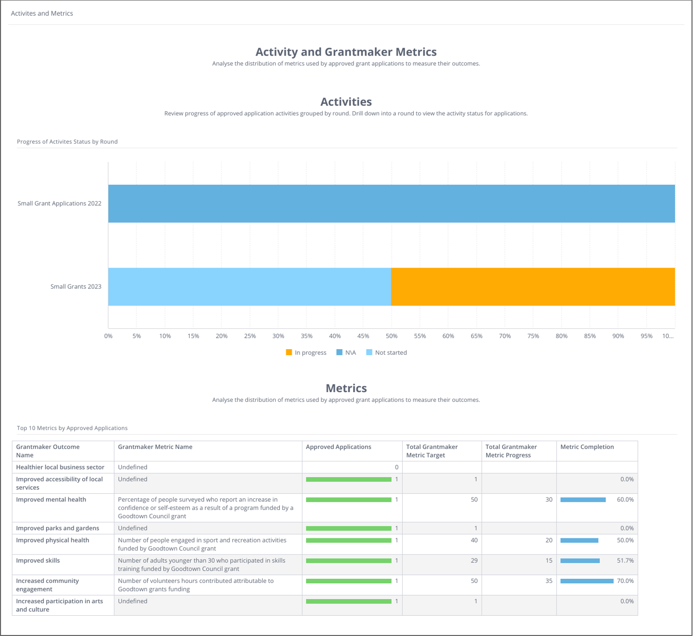
Outcomes Engine: Activities and Metrics
The Activities and Metrics dashboard shows the current status of the activities and metrics that are captured using the Outcomes Engine. The top dashboard shows the progress status breakdown of the reported activities grouped by round. Right-click on a round or status to drill down to the individual applications. The Metrics table shows the selected metrics and their current targets and progress.
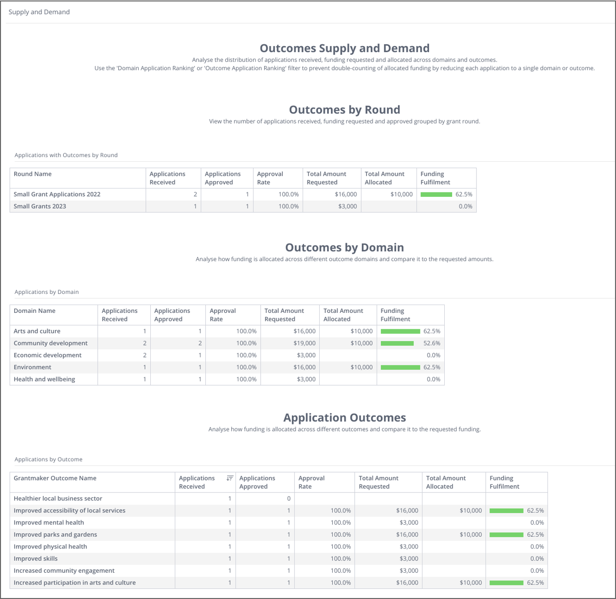
Outcomes Engine: Supply and Demand
The Outcomes Supply and Demand dashboard shows the distribution of the applications that have selected an outcome using the Outcomes Engine. The first table groups the applications with outcomes by round, showing the Approval Rate and Funding Fulfilment for these rounds. The following tables, Outcomes by Domain and Application Outcomes, group the applications by the Domain and the selected Outcomes. The dashboard can be filtered by program or round as well as the Outcomes Framework.
What's next?
To progress further, you may wish to learn about Filtering and drilling-down dashboards, or Sharing, importing, and exporting dashboards.